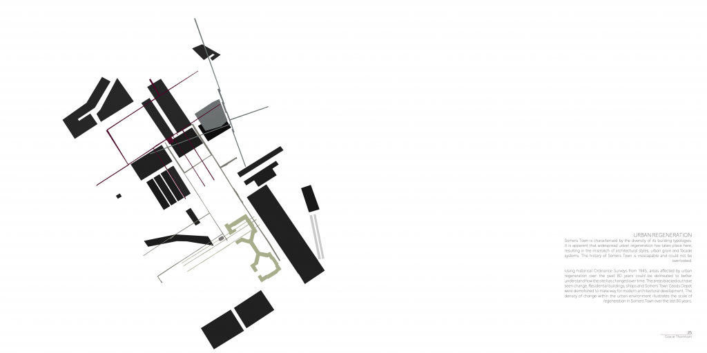
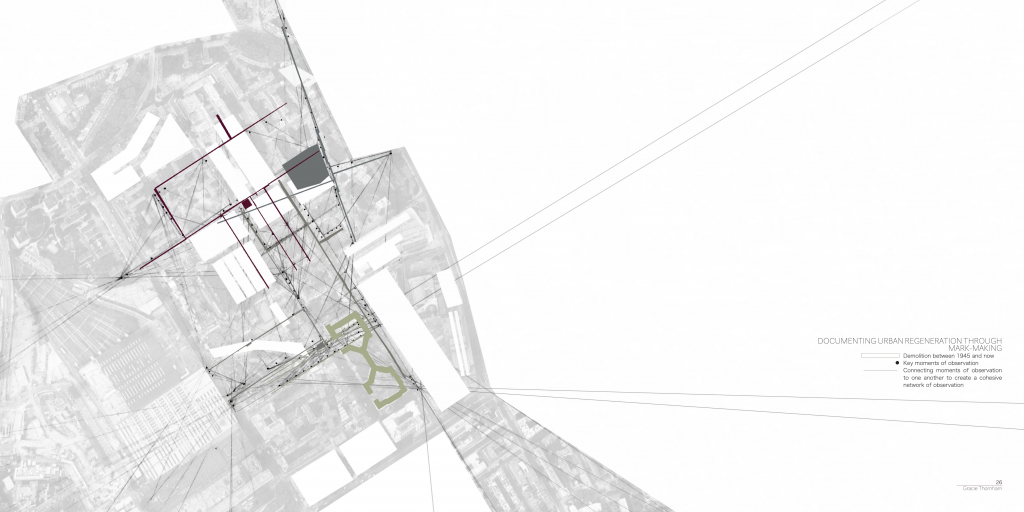
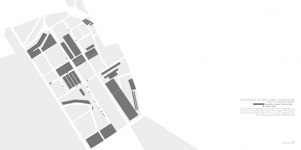
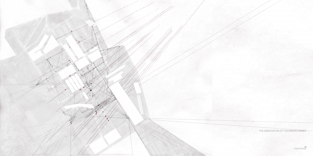
Following discussions during my week 1 tutorial, I felt that my Methods of Translating needed redirection. Up until this point, my work had primarily focused on architectural map-making as a graphic design tool. In attempts to broaden my horizons and begin the process of interweaving the disciplines of graphic design and architecture, I decided to attempt to apply an architectural theory onto a graphic design process.
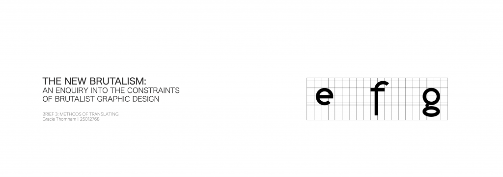
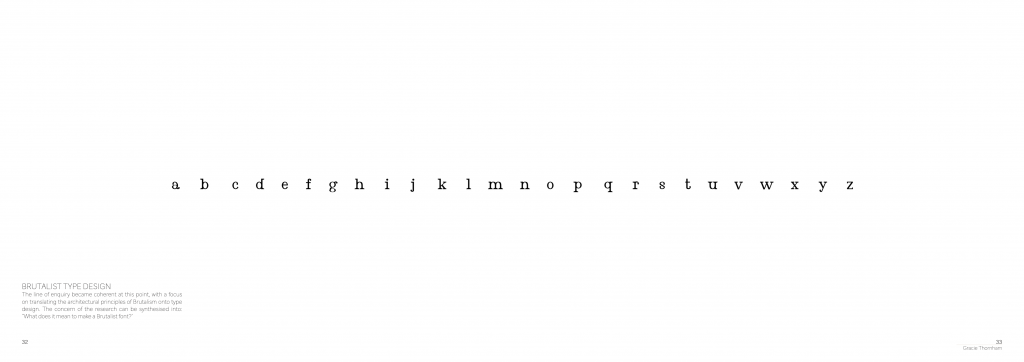
This altered my line of enquiry, and informed the overarching question: ‘What does it mean to make a Brutalist font?’. When you google “Brutalist Font”, a plethora of typefaces bounce back. As I scrolled through the pre-existing ideas of Brutalist type design, I noticed that very few of adhere to Reyner Banham’s (1955) definition of Brutalism.
Fig. 1. Brutalist Fonts on MyFonts.
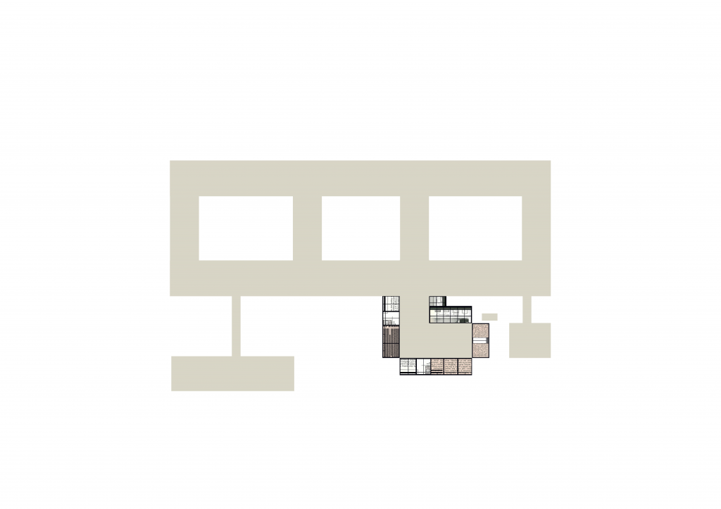
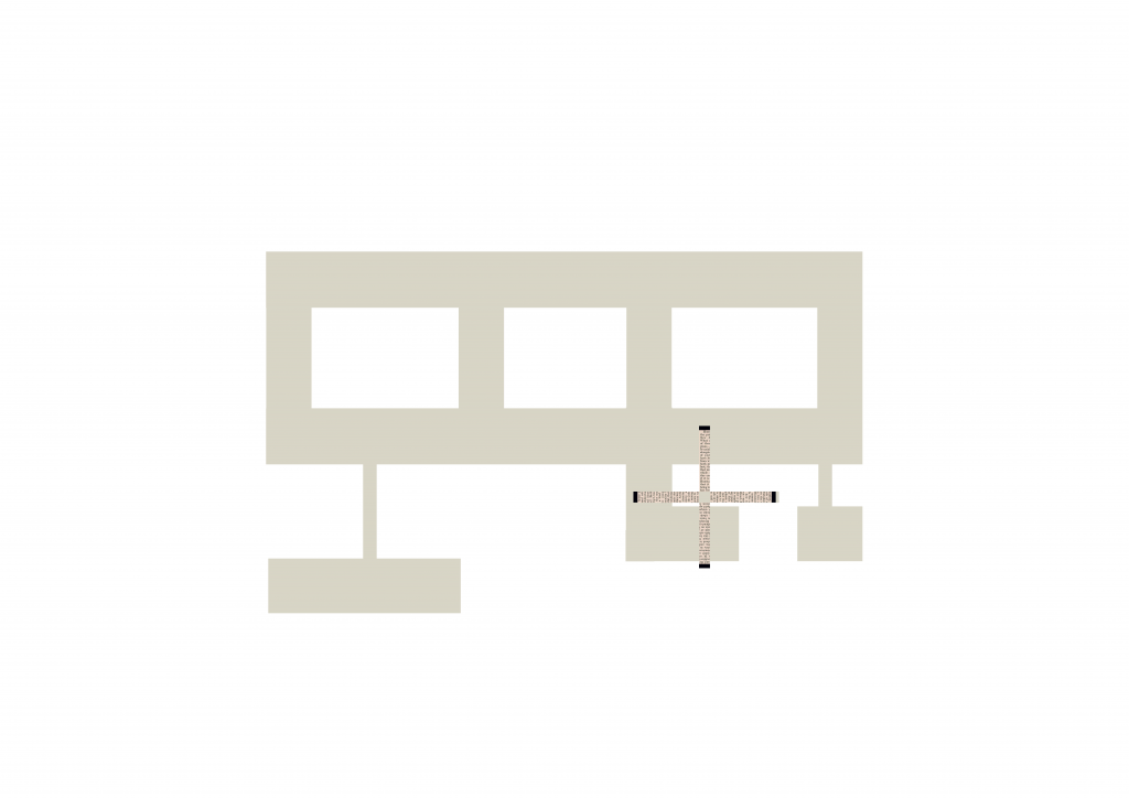
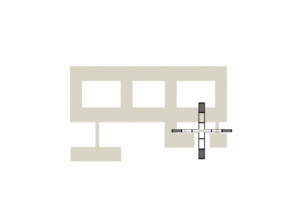
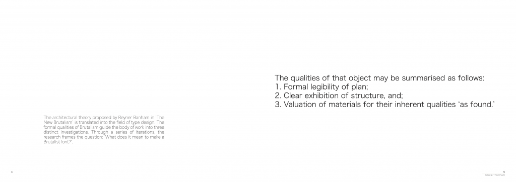
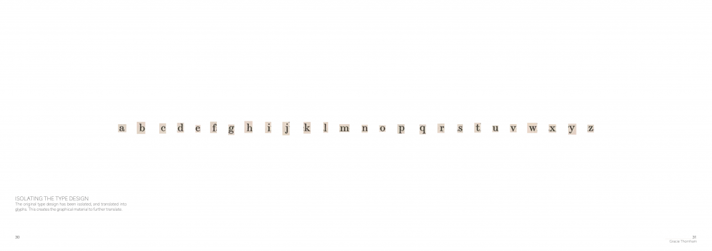
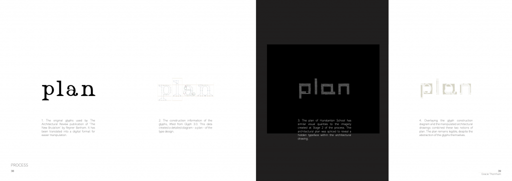
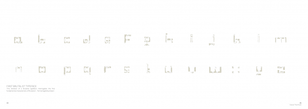
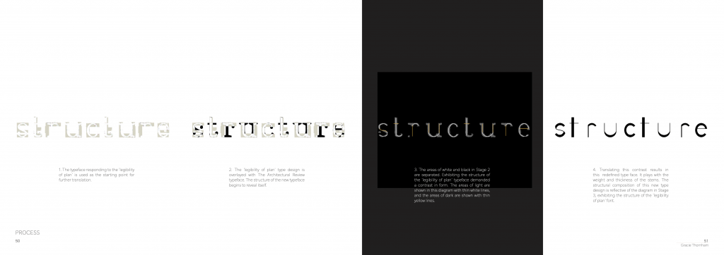
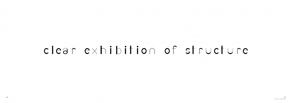
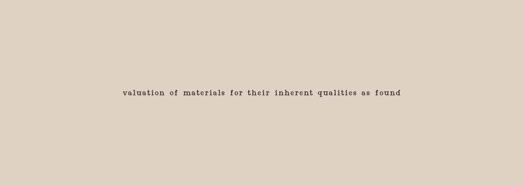
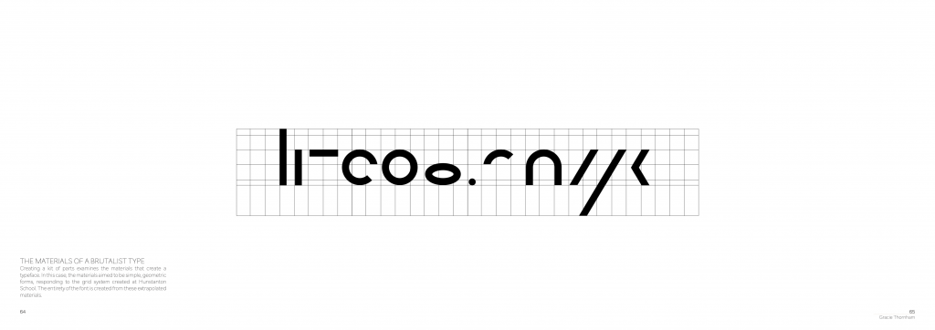
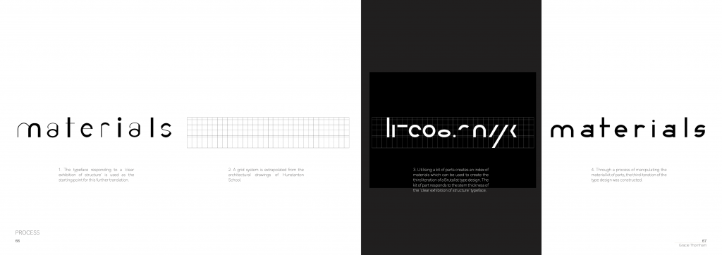
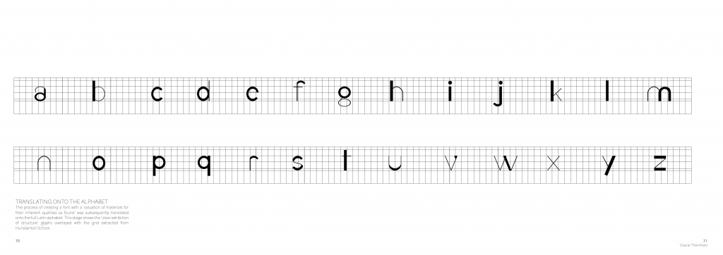
The original type design from The Architectural Review article acted as the starting for my investigation into a Brutalist type face. Through a process of iterative redesign, three Brutalist type faces were created, all building upon the form of the previous. These three type faces followed Banham’s (1955, p.357) definition of Brutalism – ‘1, Formal legibility of plan; 2, clear exhibition of structure, and 3, valuation of materials for their inherent qualities ‘as found’.’
Fig. 2. Process of creating Formal Legibility of Plan type design.Fig. 3. Process of creating Clear Exhibition of Structure type design.Fig. 4. Process of creating Valuation of Materials for their Inherent Qualities ‘As Found’. type design.
Reference List:
Banham, R. (1955) ‘The New Brutalism,’ The Architectural Review, 118 (708), pp. 335-361.
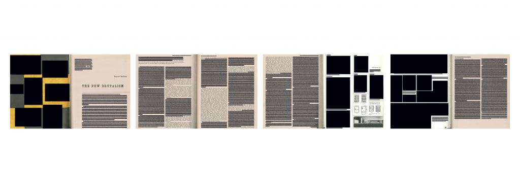
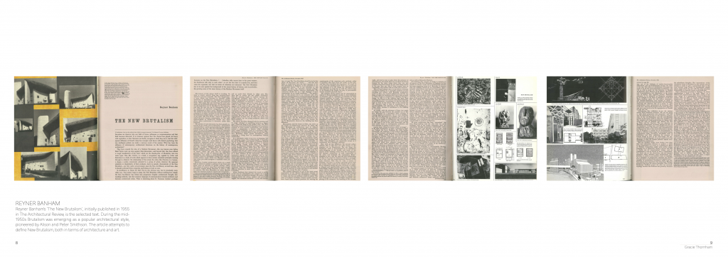
The New Brutalism by Reyner Banham (1955) was my selected material to translate. The journal article was published in The Architectural Review in 1955, and explored the earliest definition of the architectural movement. The true definition of Brutalism has been shrouded in mystery since its inception, with architectural critics rarely agreeing on a set of defining characteristics.
Banham’s (1955) writing coincided with the rise of architects Alison and Peter Smithson. The Smithon’s are considered to be the founders of Brutalism, as they began to experiment with architectural detailing, where the materials retain their inherent qualities ‘as found’ (Banham, 1955).
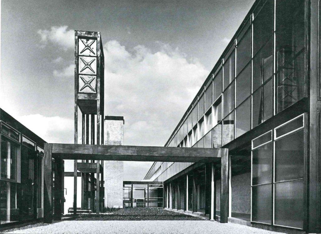
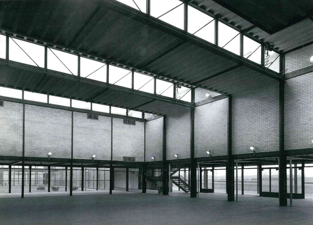
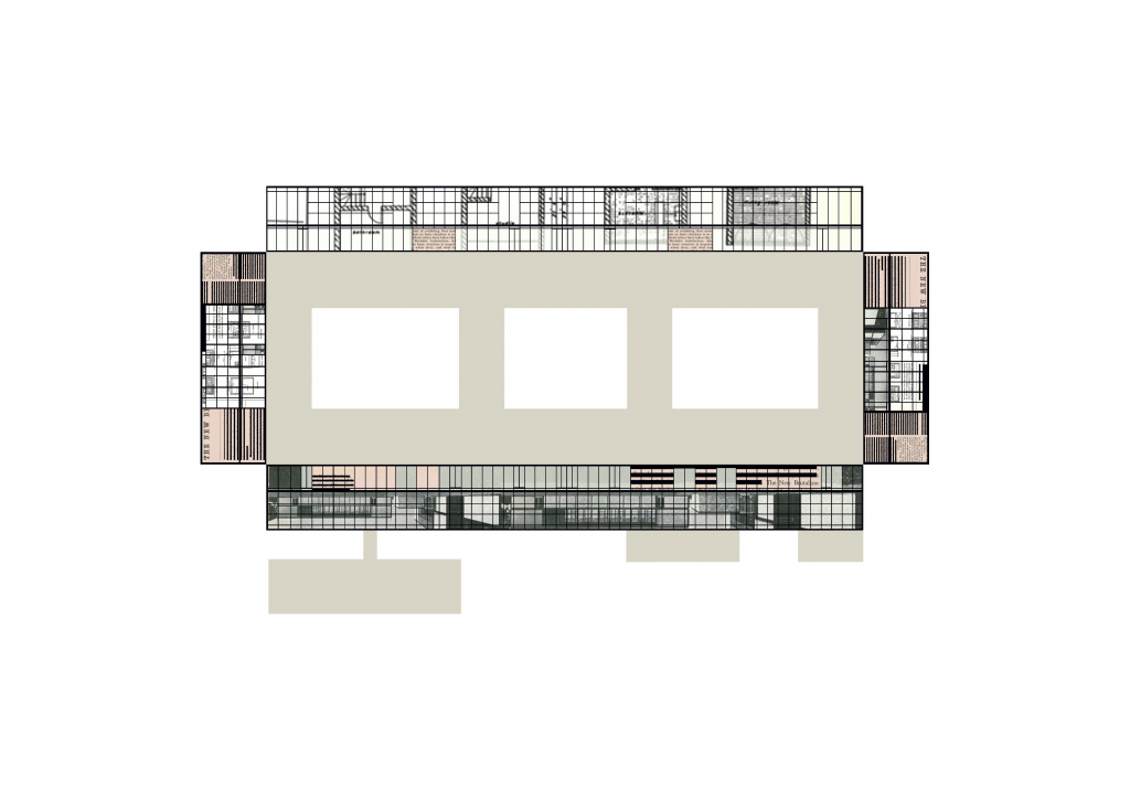
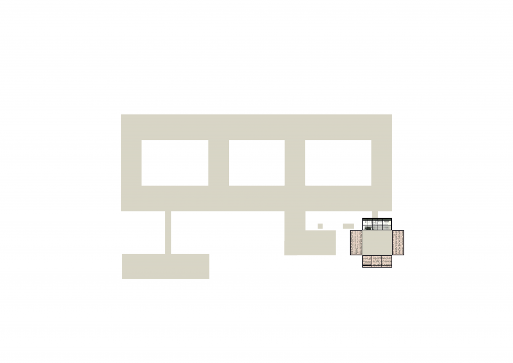
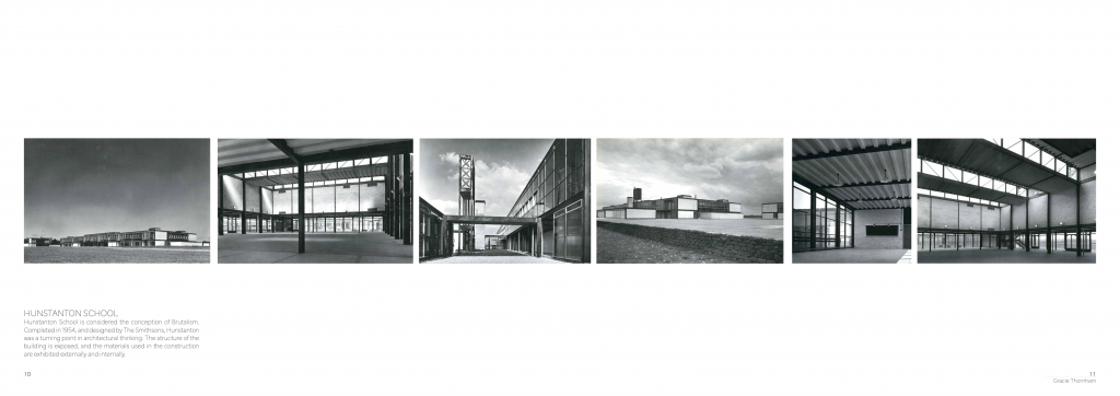
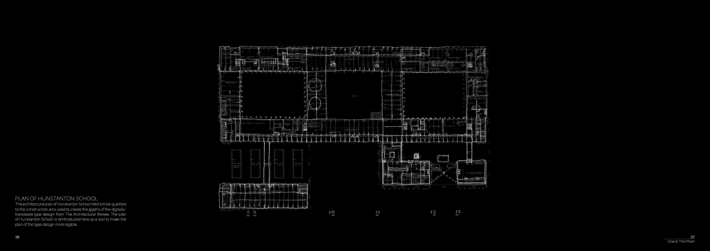
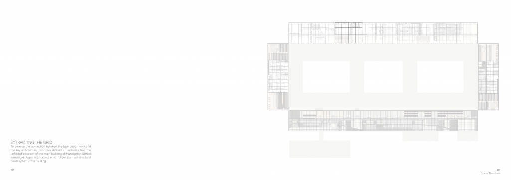
Hunstanton School by Alison and Peter Smithson is considered by many as the first Brutalist building, as it adheres to Banham’s (1955) definition of The New Brutalism. I focused my observation onto Hunstanton School.
Fig. 1. Photographs of Hunstanton School by Nigel Henderson (2001).
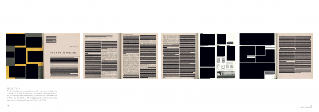
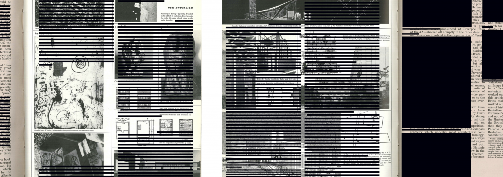
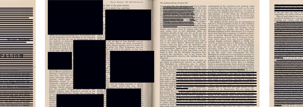
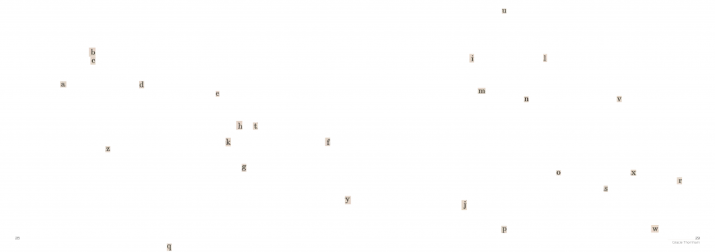
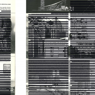
My initial method of investigation looked at redacting the text, leaving only the content about Hunstanton School exposed.
Fig. 2. Redacted text focusing on the writing about Hunstanton School.
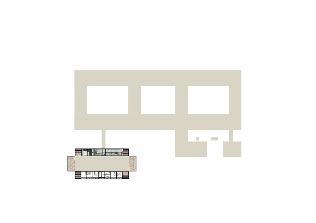
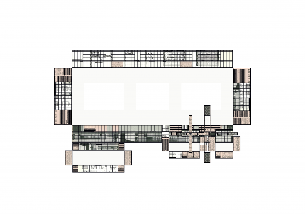
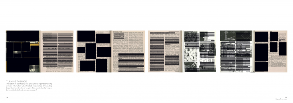
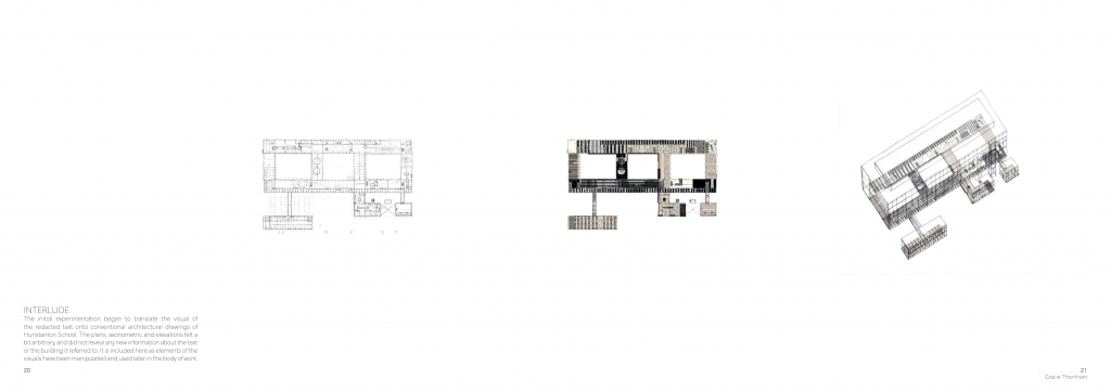
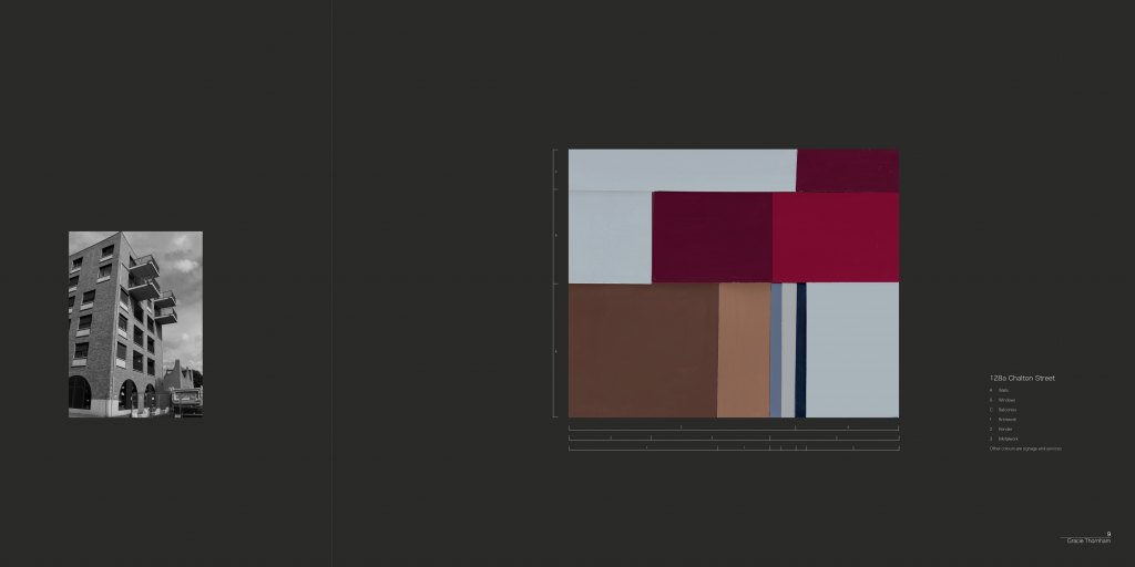
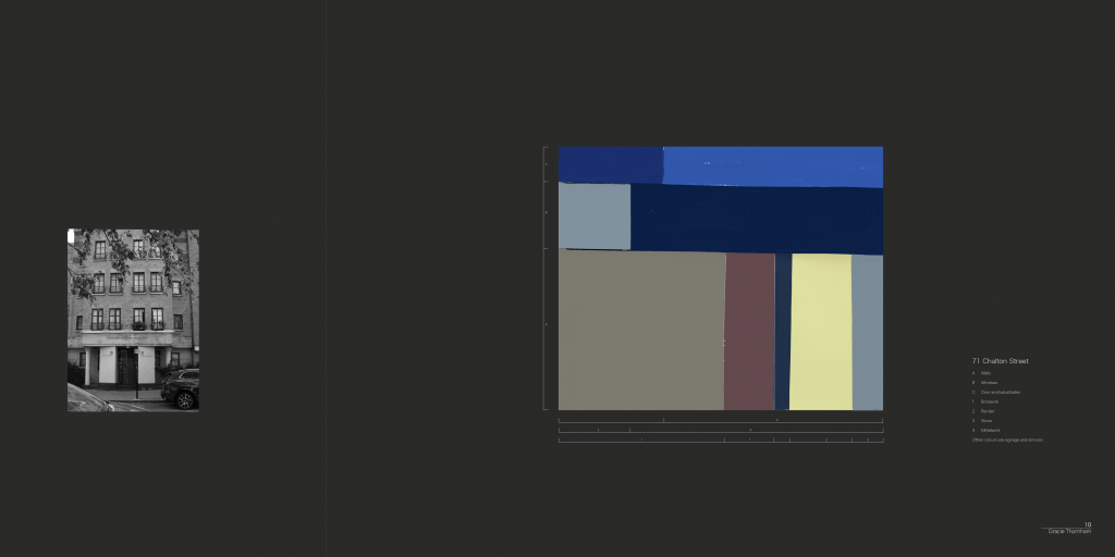
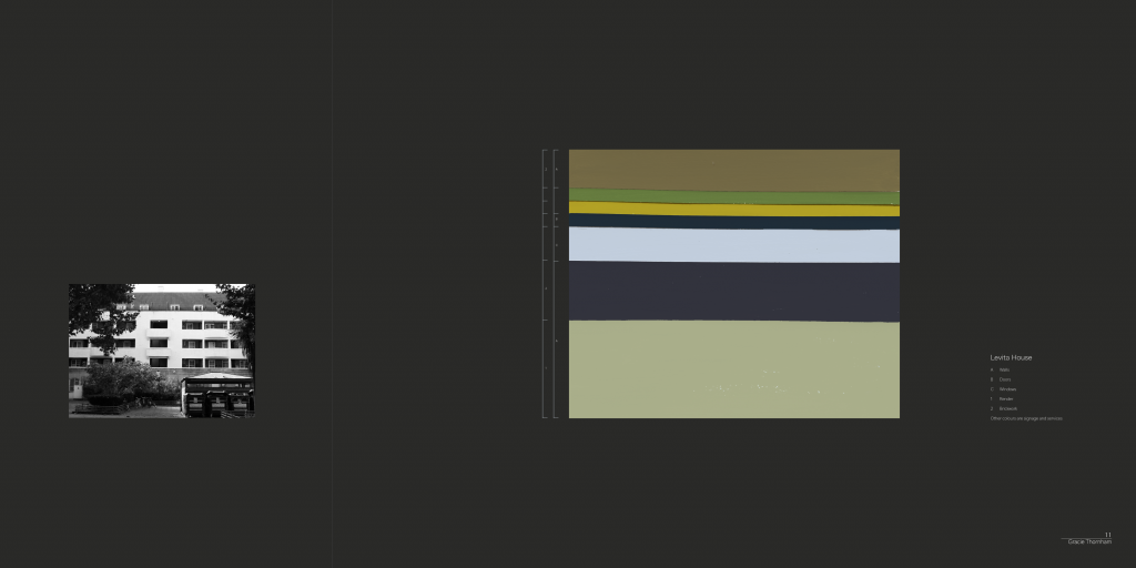
Using the visual language of the redacted article, I began to see architectural patterns within the imagery. I subsequently translated the visual imagery of the text into semi-conventional architectural drawings. I opted to unfold the facade elevations around the architectural floor plan, creating the textures of the materials using the fabric of the redacted article.
Fig. 3. Elevations of different volumes, created using visual elements of the redacted text.
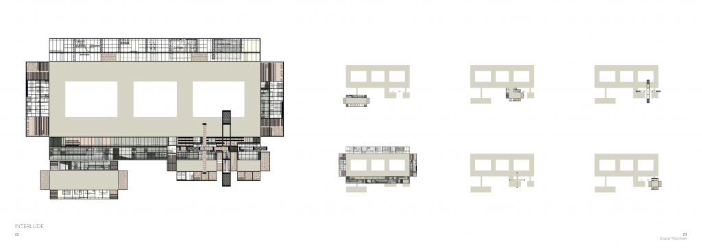
Fig. 4. Overlayed unfolded elevations to illustrate the material fabric of the facade.
Reference List:
Banham, R. (1955) ‘The New Brutalism,’ The Architectural Review, 118 (708), pp. 335-361.
Henderson, N. (2001) The charged void: Architecture – Alison and Peter Smithson [Photograph]. Available at: https://hicarquitectura.com/2023/07/alison-and-peter-smithson-hunstanton-school/(Accessed: 11 November 2025).
Select one reading from the course reading list and ‘re-present’ its main arguments and ideas using the
structure,
form, or
method
of another on the reading list.
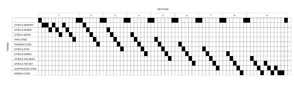
To translate the structure of Invisible Cities by Italo Calvino (1972) onto another text, the pattern of the book must first be examined. The text is guided by a framework of fictitious conversations between Venetian merchant, Marco Polo, and the former emperor of the Yuan Dynasty in China, Kublai Khan. The conversational tone of the text creates a whimsical representation of the architectural principles of the 13th Century, bridging the gap between Eastern and Western design. Calvino (1972) creates a tension between the real and surreal in Invisible Cities through the imagination of the conversations between these two historical characters.
Fig. 1. Diagrammatic representation of the structure of Invisible Cities (Calvino, 1972).
The 55 invisible cities are catalogued into eleven themes. Calvino (1972) adopts a non-linear structure, where these themes are woven into nine sections of the book. This non-linear pacing magnifies the overarching topics of the book, particularly memory. Similarly to memory, the structure of the book is cyclical, with themes being reviewed periodically. Representing the configuration of Invisible Cities as a diagram further illustrates the cyclical system in which the themes are introduced and, subsequently, re-introduced (Calvino, 1972).
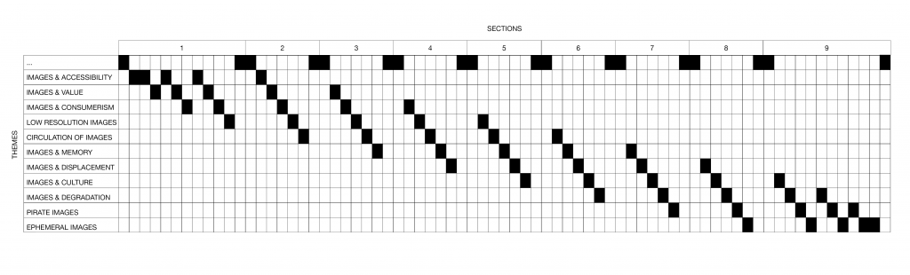
Applying the same structural logic onto Hito Steyerl’s In Defense of the Poor Image (2012) reveals different thematic strands, all in relation to the ‘Image’.
Fig. 2. Translated theme titles, responding to the main arguments within In Defense of the Poor Image (Steyerl, 2012).
Overarching similarities, including memory and reality, can be drawn between Steyerl (2012) and Calvino’s (1972) texts. This informed the translation of Steyerl’s (2012) writing, which follows the non-linear, thematically catalogued structure of Invisible Cities, rather than a translation into dialogue (Calvino, 1972).
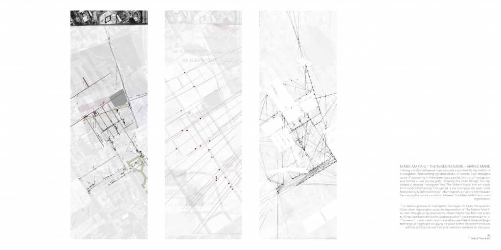
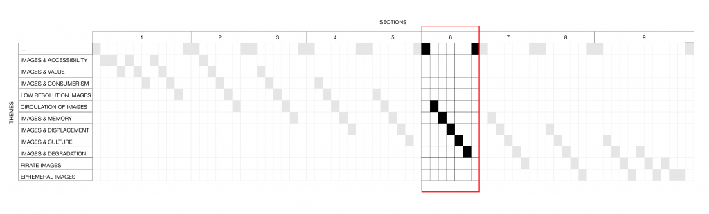
Due to the brief nature of this writing, only Section 6 will be re-presented, allowing for a more focused consideration.
Fig. 3. Focus on the structure of Section 6.
Circulation of Images 5
Quality is transformed into accessibility. A poor image is created when it can be viewed by the masses, therefore quality of image must be surrendered in favour of widespread circulation.
Images & Memory 4
Memory attached to an image is implicit. Its memory is inherent as the quality reveals the history of its viewership.
Images & Displacement 3
The process of decontextualising enables co-ownership of an image. The semantics of a poor image will be altered, as it is uprooted from its original context.
Images & Culture 2
Commodification of images is reflective of the paradigm shift towards a culture of mass-consumption.
Images & Degradation 1
Incessant redistribution of images creates a visual uncertainty.
The circular nature of both readings is apparent; Calvino (1972) amplifies the non-linearity of memory through the structure of the text, whereas Steyerl (2012, p.43) repeatedly discusses the cyclicality of ‘distribution circuits’ of poor images. The translation of In Defense of the Poor Image, reinforces and further amplifies the notion of the poor image (Steyerl, 2012). The procedure of copying, reformatting, and redistributing defines a poor image. This same process has been undertaken during the structural translation of Steyerl’s writing (2012). The result: a ‘poor image’ of In Defense of the Poor Image (Steyerl, 2012). Through ‘re-presenting’ In Defence of the Poor Image (Steyerl, 2012), within the framework of Invisible Cities (Calvino, 1972), the text has become flattened, inevitably filtering out some of the themes and information discussed in the original, unaltered text.
Reference List:
Calvino, I. (1972) Invisible Cities. Translated from the Italian by W. Weaver. London: Vantage Books.
Steyerl, H. (2012) ‘In Defense of the Poor Image’ in The Wretched of the Screen. Berlin: Sternberg Press, pp. 31-45.
Select any text – or excerpt of any text – from the reading list and apply one of the following methods of cataloguing in order to analyse its purpose value of meaning: 1. Inventory, 2. Metadata.
Census, Map, Museum in Imagined Communities by Benedict Anderson (2006, pp.163-185) critically investigates the mode in which the ‘colonial state imagined it’s dominion’. The chapter is already formatted into an index, categorised by Census, Map,and Museum. The existing framework of the text guides the discourse through the lens of these three different scopes. The text is also implicitly subcategorised by theme. The overarching topics of the text examine the methods of control employed by the colonial state to validate their protectorate; 1. ‘The nature of the human beings it ruled’, 2. ‘The geography of it’s domain’, 3. ‘The legitimacy of its ancestry’ (Anderson, 2006, p. 164).
The primary conclusion Anderson draws from his findings is that the colonial state applied a ‘totalising classification grid’ to all facets of life under the regime’s control (Anderson, 2006, p.183). The act of categorising maintained control over the region, as their rule was bounded and determinate (Anderson, 2006, p.183). Anything that did not adhere to this classification grid was considered as ‘other’ – a category used to box ‘all real-life anomalies’ (Anderson, 2006, p.183).
Utilising a classification grid, mirroring the one adopted by colonial rulers used to legitimise their occupation, catalogues Anderson’s arguments both thematically and structurally. Employing this inventory method further reinforces the rigidity of the colonial’s imagination of its domain, but also explores a further indexical subcategorisation of the structure of Anderson’s text (2006).
The warp of the grid (columns) is thematic; fixed and sterilised, whereas the weft (rows) is the scale of investigation; specific and focused. The differing scales of the investigation – Census, Map, Museum – weave a narrative through the fixed methods adopted by the colonial state to imagine its dominion – ‘The nature of the human beings it ruled’, ‘The geography of it’s domain’, ‘The legitimacy of its ancestry’.
The nature of the human beings it ruled
The geography of it’s domain
The legitimacy of its ancestry
Census
The strive for unambiguity and completeness created a system of cataloguing people, which often overlooked the ethnodiversity, language, and religion in the area.
There was vast disparity across the census-maker’s imaginations of their dominion, creating inconsistencies across data sets.
The subcategorisation of the census was not a true depiction of the ancestry of the land, and those living within the territory would not have recognised themselves under the labels thrust upon them.
Map
Colonial cartographers and census-makers imposed the same surveillance on the human beings they ruled, through a system of total classification.
Prior to colonisation, map-making was a borderless practice, with a focus on documenting marching and sailing times. With the influx of colonial rule, boundaries were imposed onto the land, in attempts to quantify the territory in which they occupied.
Borders hold importance in determining sovereign authority. These man-made constructs were used to legitimise colonisation, as the creation of new boundaries provided a sense of self-determination over the land.
Museum
Construction of cultural monuments created a hierarchical tension between the builders and the colonial natives.
In the later waves of colonialism, there was a paradigm shift from conquest to an effort to legitimise colonial rule. Once borders were established, focus turned to justifying colonial occupation.
Prestige was intimately associated with the colonisers’s homeland. The colonisers with greater status used this as a tool to legitimise their ancestry and stake over the land.
Utilising a classification grid onto Anderson’s Census, Map, Museum (2006, pp.163-185), reflects the rhetoric that was communicated in the text. The inventory system creates a pattern discrimination (Apprich et. al., 2018), excluding arguments that do not fit the framework of the classification grid, discarding them as ‘other’ (Anderson, 2006, p.183). This method of cataloguing, both examines the structure and themes of the text, whilst amplifying Anderson’s argument that a system of classification was used to justify the colonial ruler’s imagination of their dominion (2006, pp.163-185).
Reference List:
Anderson, B. (2006) ‘Census, Map, Museum’ in Imagined Communities. London: Verso, pp.163-185.
Apprich, C. et al. (2018) Pattern Discrimination. London: Meson Press.
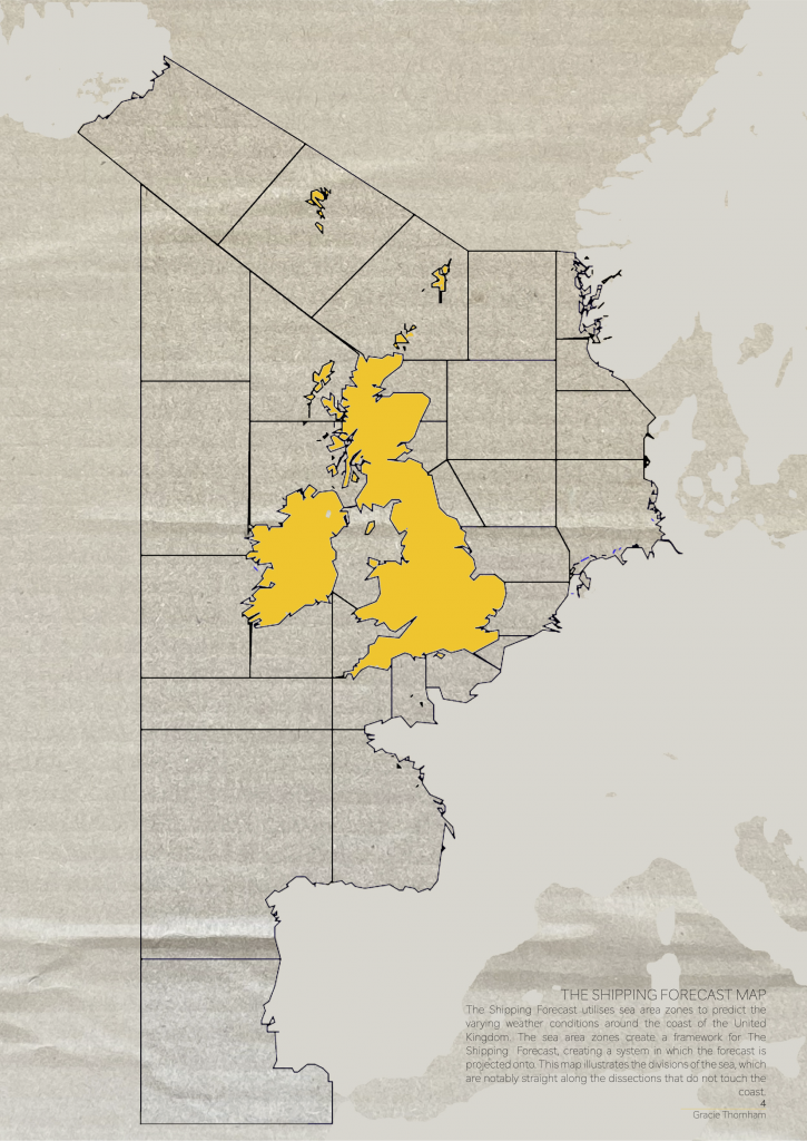
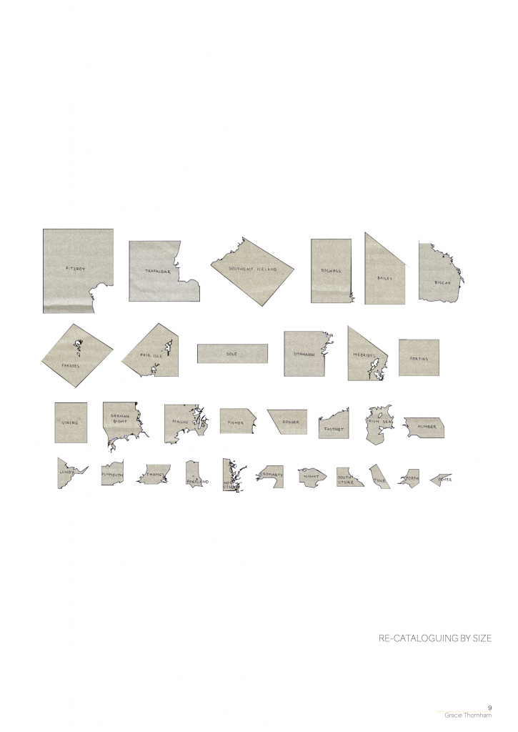
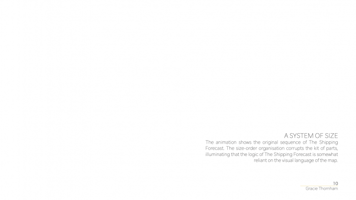
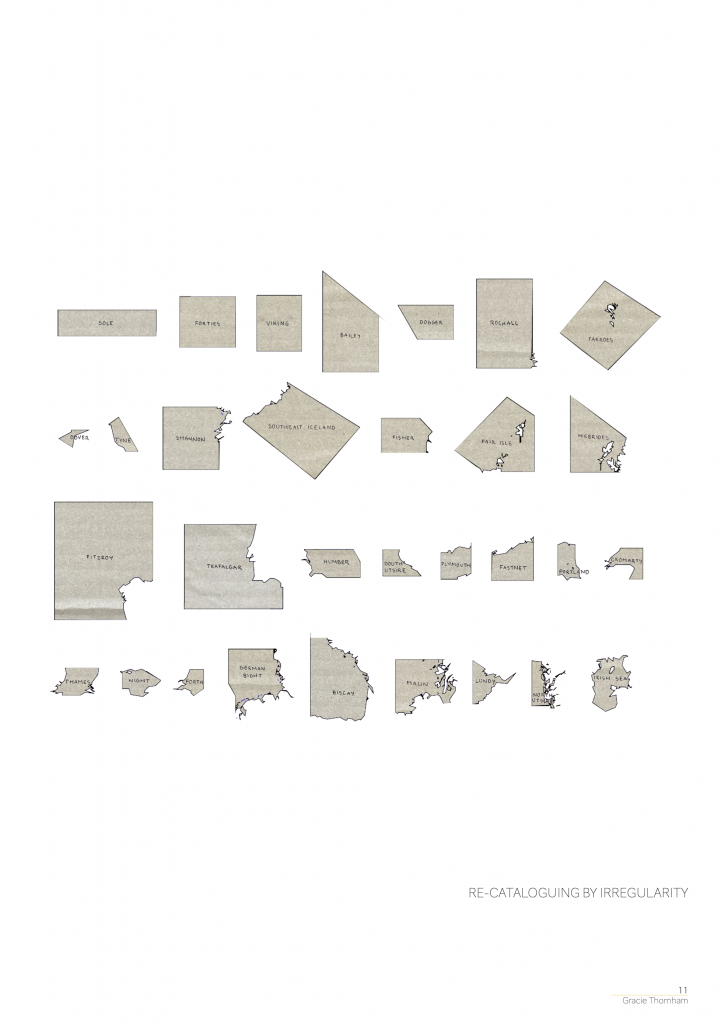
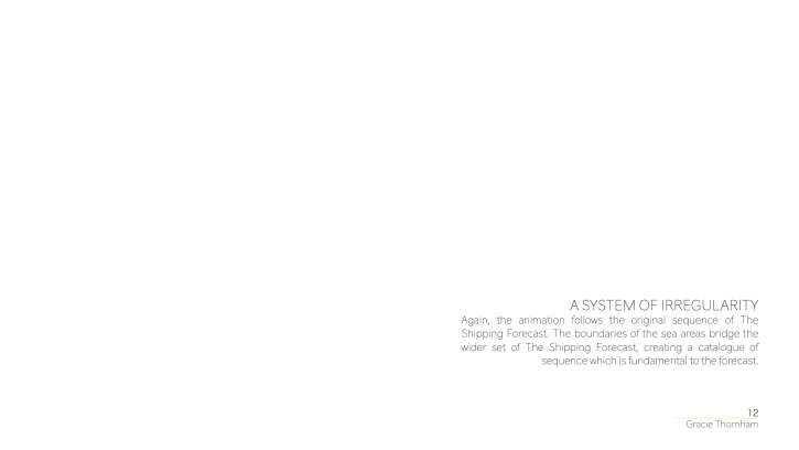
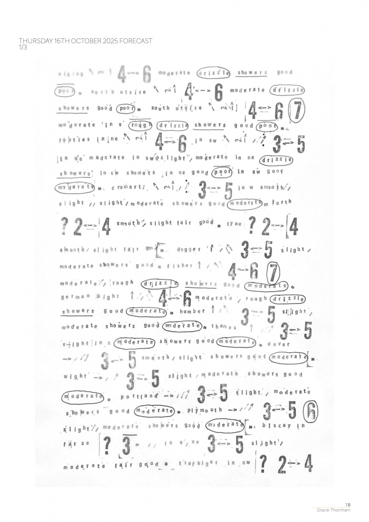
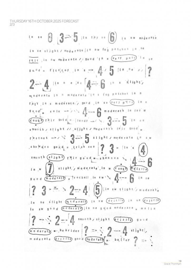
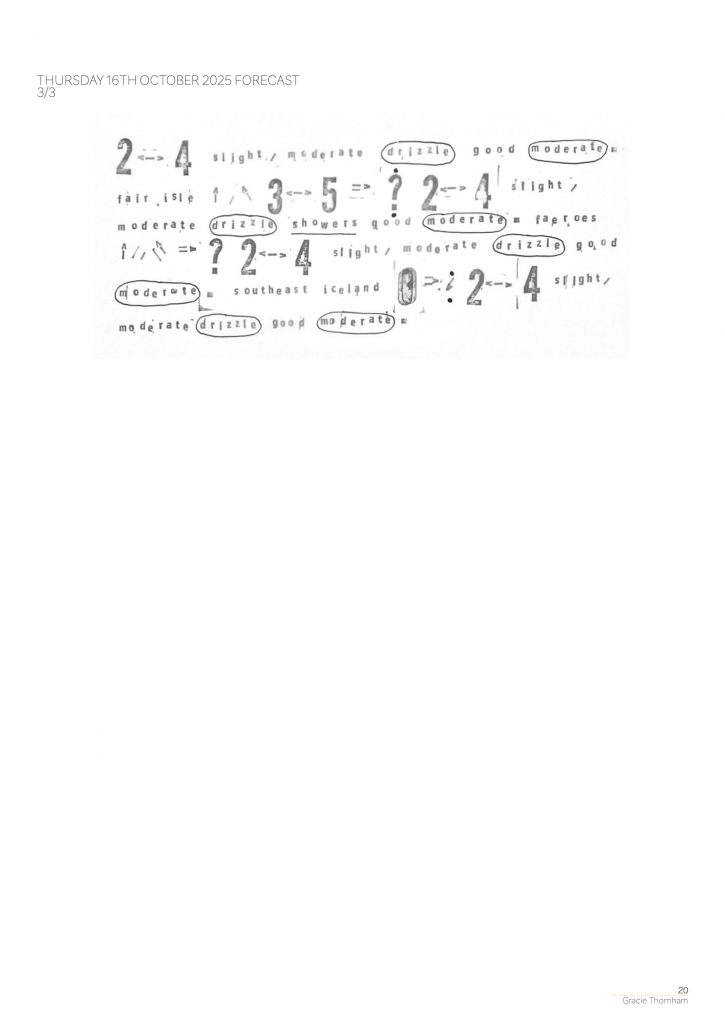
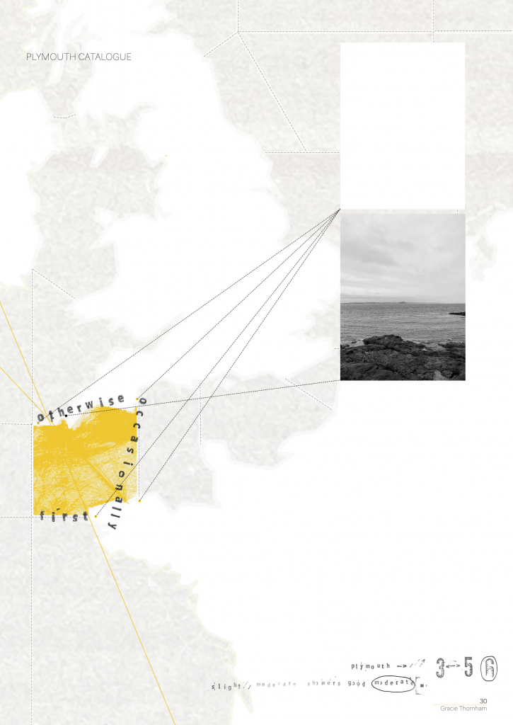
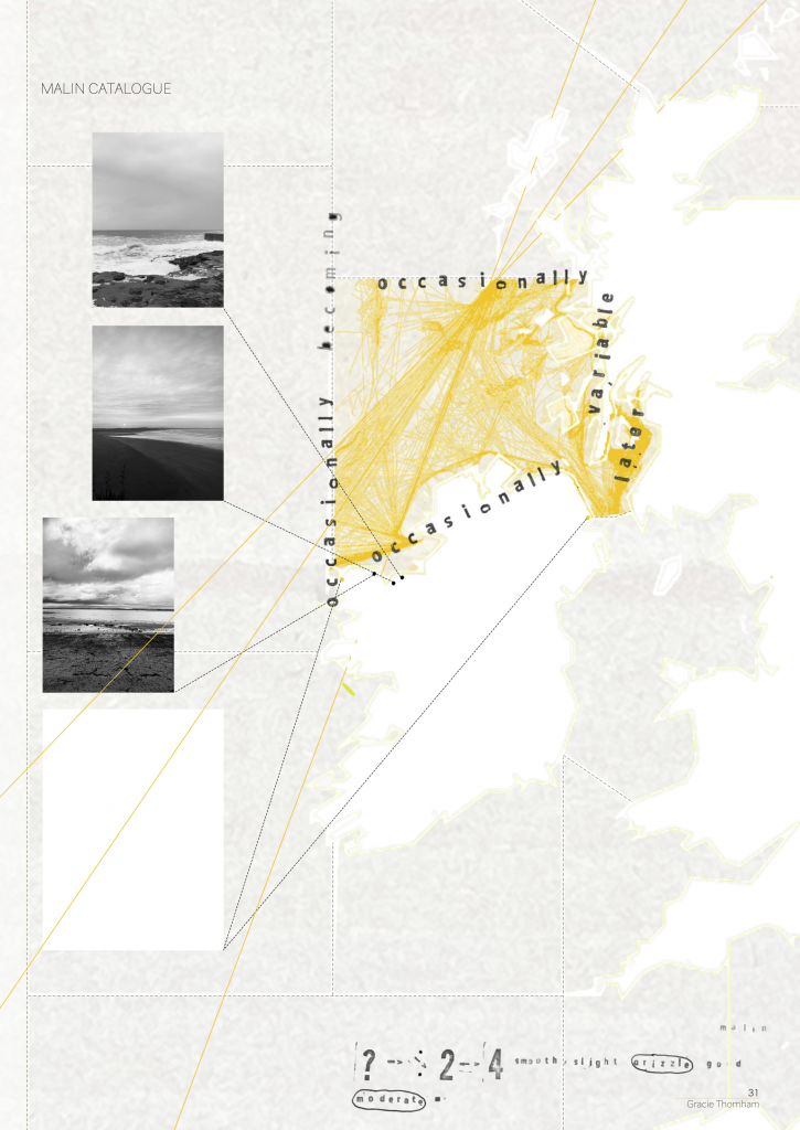
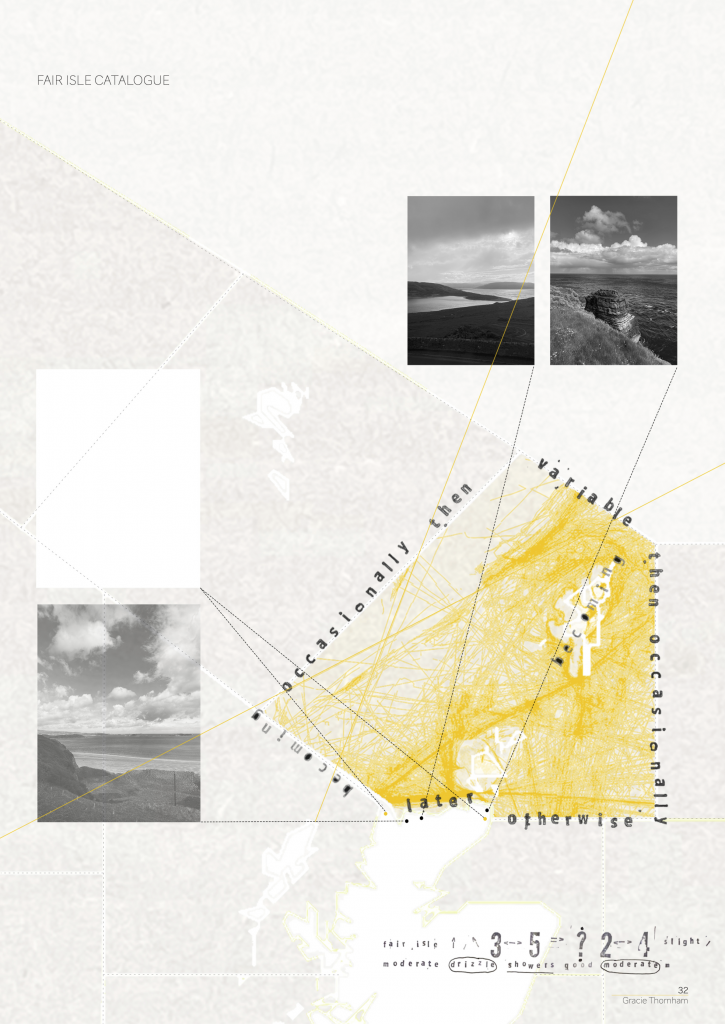
During the first week of Brief 2, Methods of Cataloguing, I explored the temporality of The Shipping Forecast. Historically the forecast was only circulated via the radio. Initially, I tried to capture the transient nature of the forecast using animation.
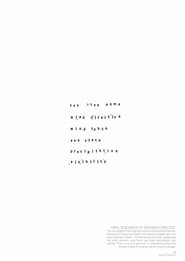
There is a defined sequence in which the sea area zones are forecast, starting from the top right and moving clockwise. This pattern remains consistent across every forecast. The Shipping Forecast is broadcasted every 6 hours, due to the rate at which the sea state changes. The rapid speed in which the forecast shifts and changes is mirrored in the speed of the animation.
Fig. 1. Sequencing the sea area zones in The Shipping Forecast.
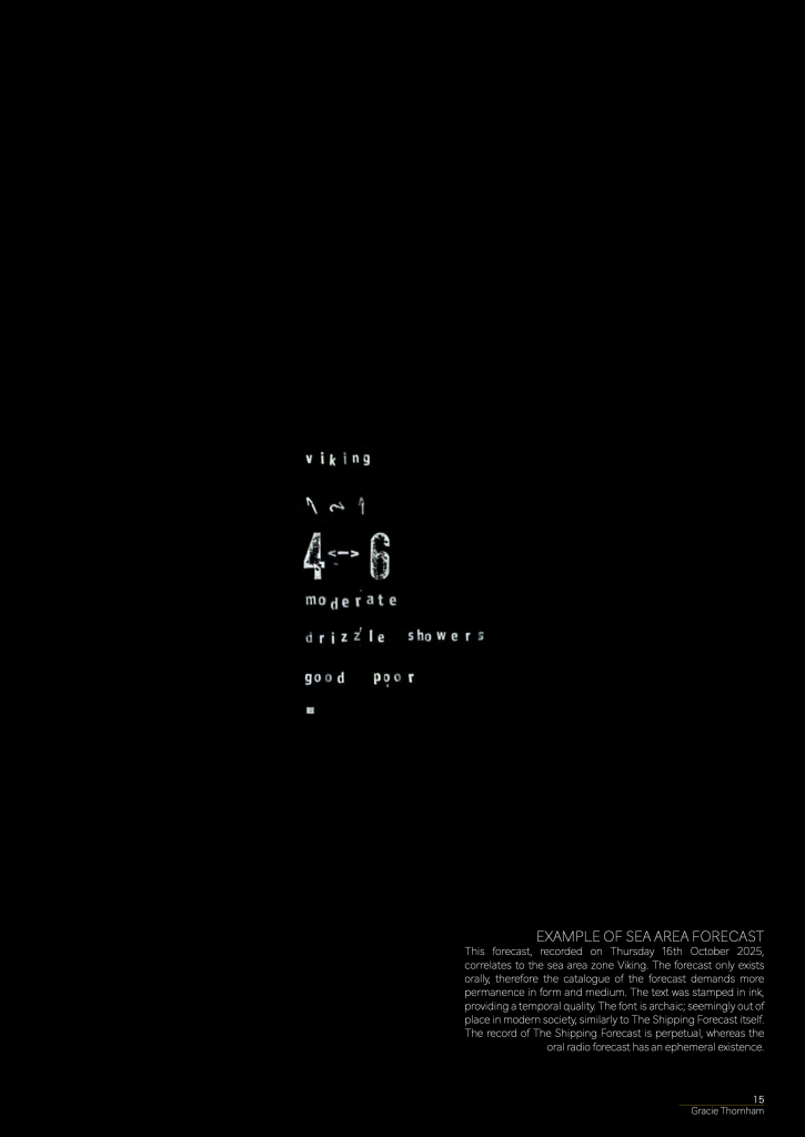
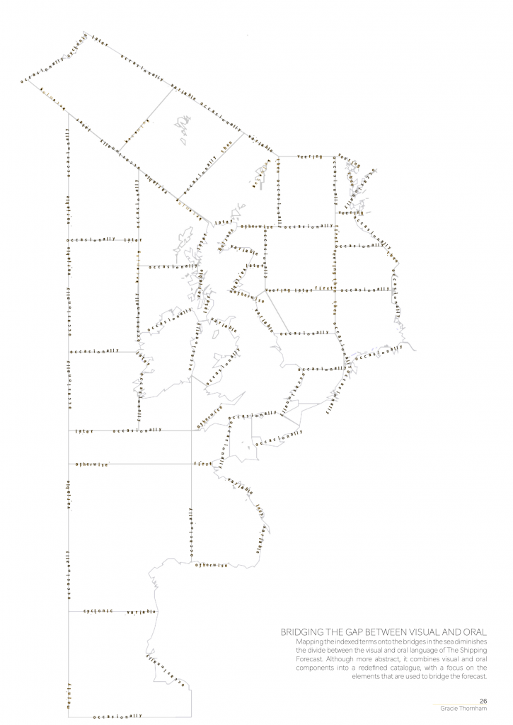
The forecast only exists orally, therefore the catalogue of the forecast demanded more permanence in form and medium. The text was stamped in ink, providing a temporal quality. The font is archaic; seemly out of place in modern society, similar to The Shipping Forecast itself. The record of The Shipping Forecast is perpetual, whereas the oral radio forecast has an ephemeral existence.
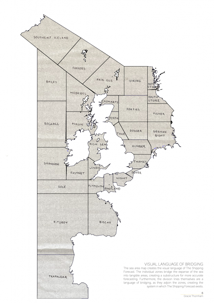
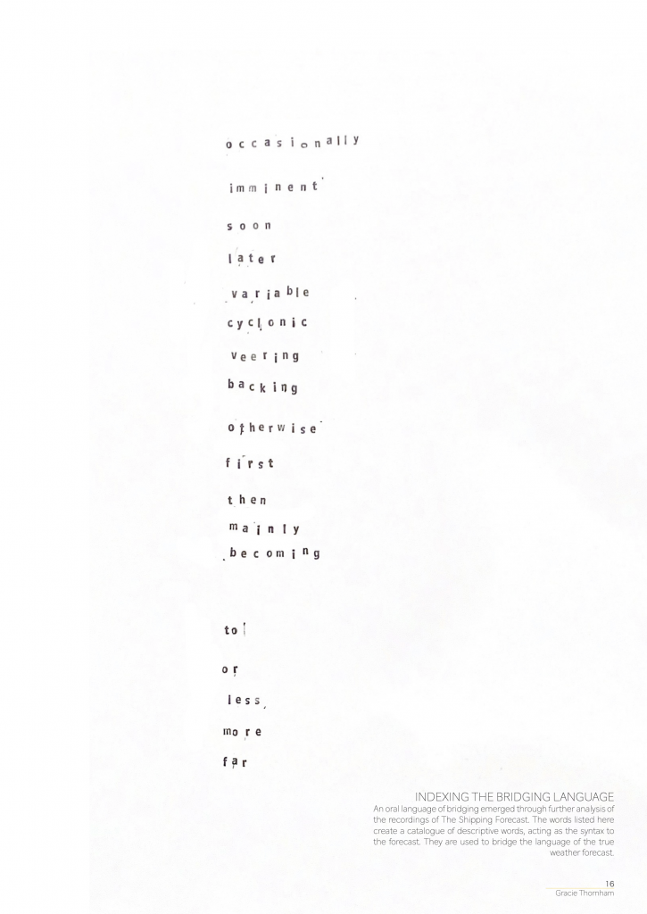
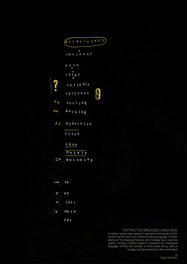
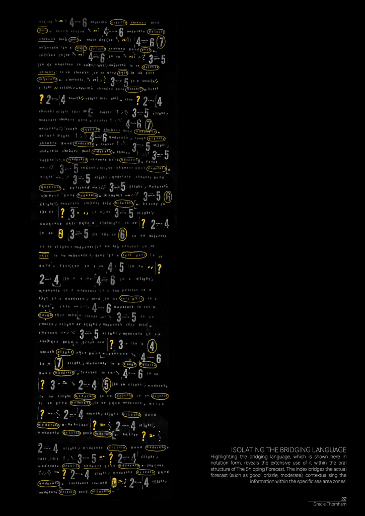
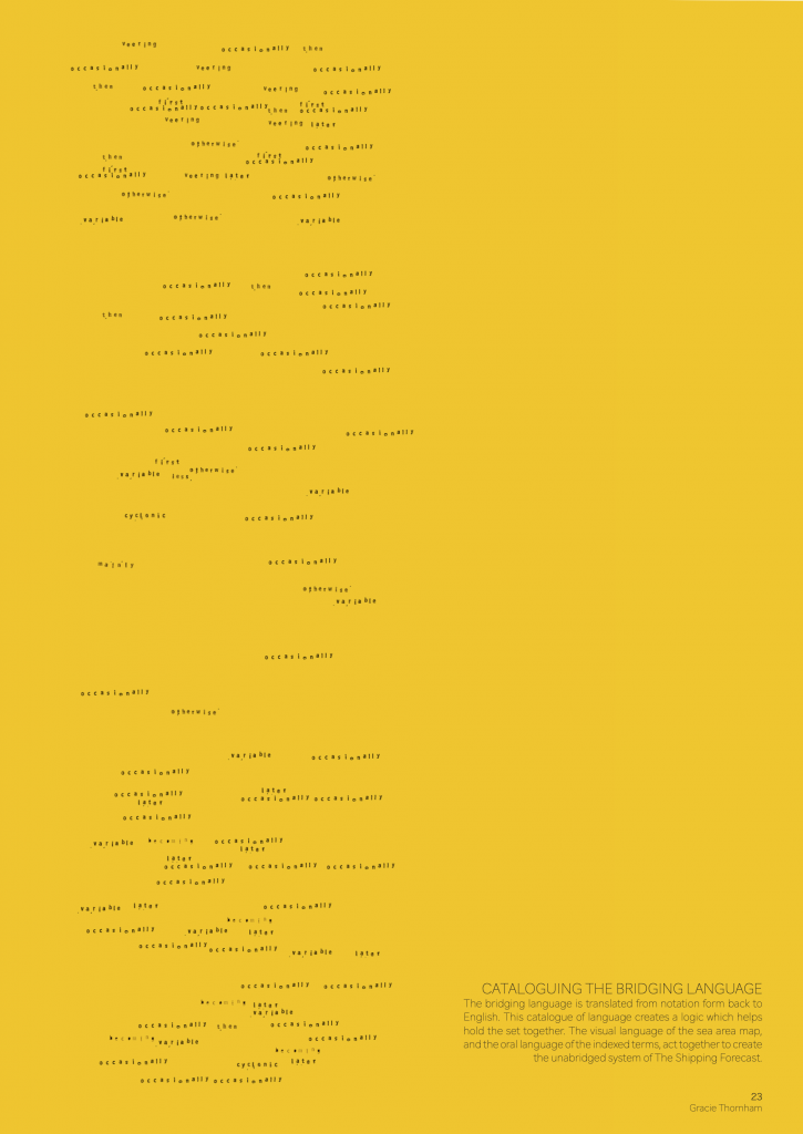
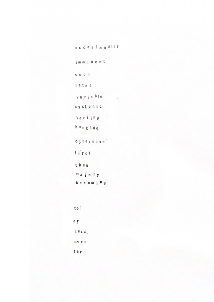
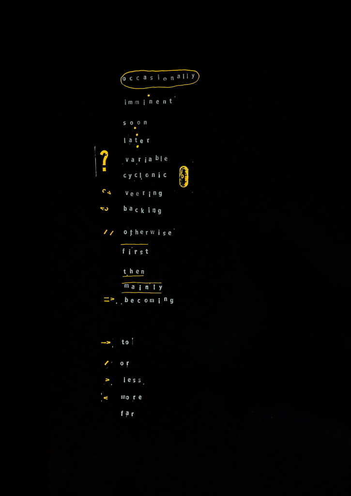
Fig. 2. Index of terms which are used to bridge the forecast, providing further context to the weather conditions. They are often overlooked, but are the true descriptors of the forecast. I created a notation system to both conceal them within the monotony of the forecast, as well as reveal their importance in holding the oral language of The Shipping Forecast together.
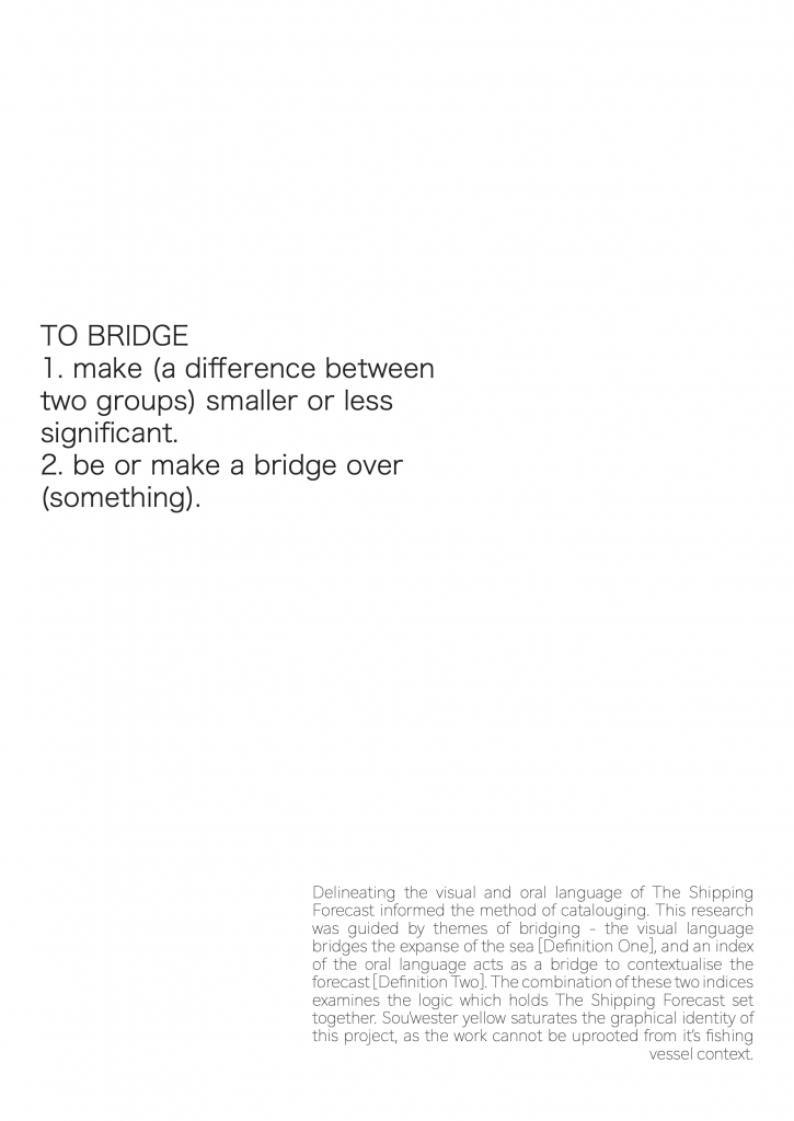
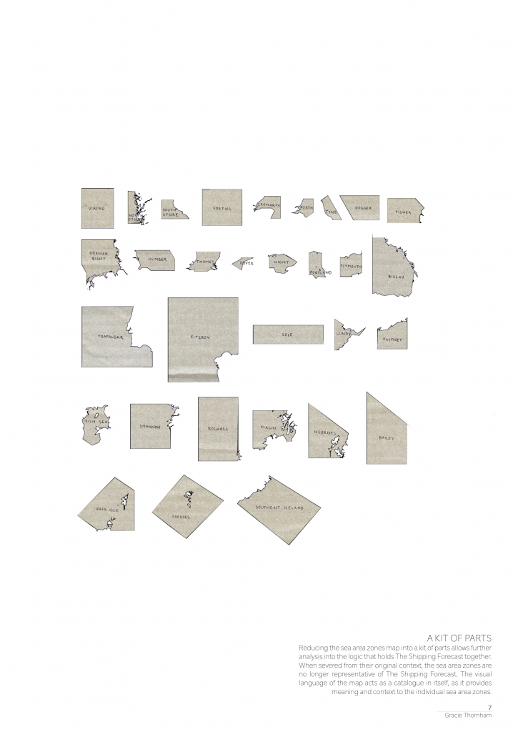
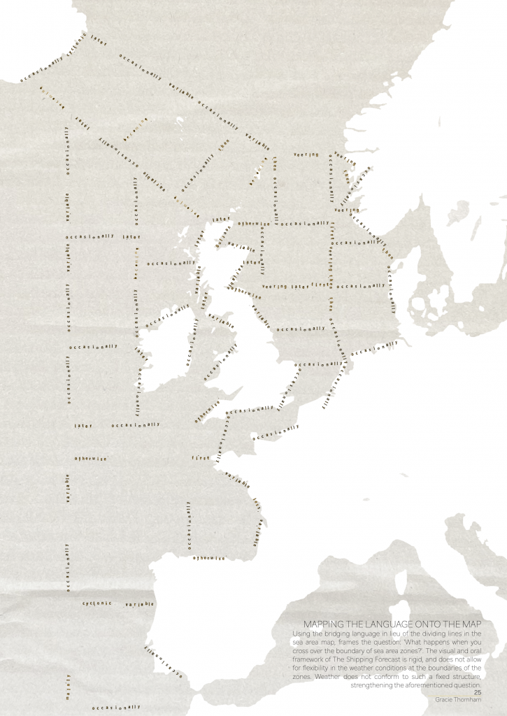
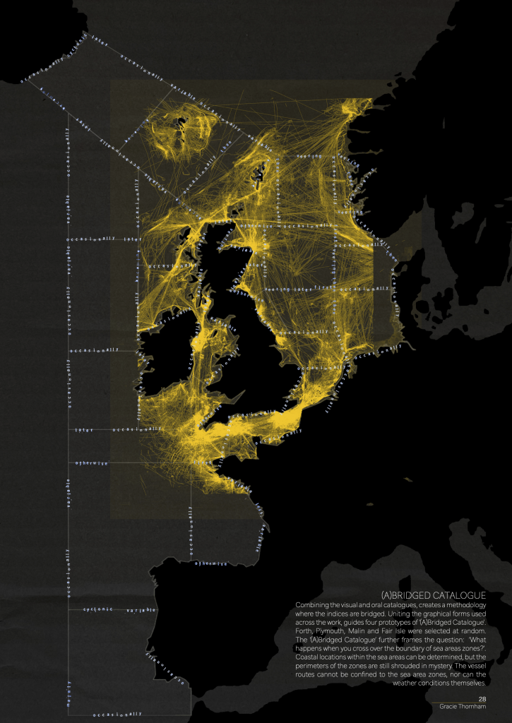
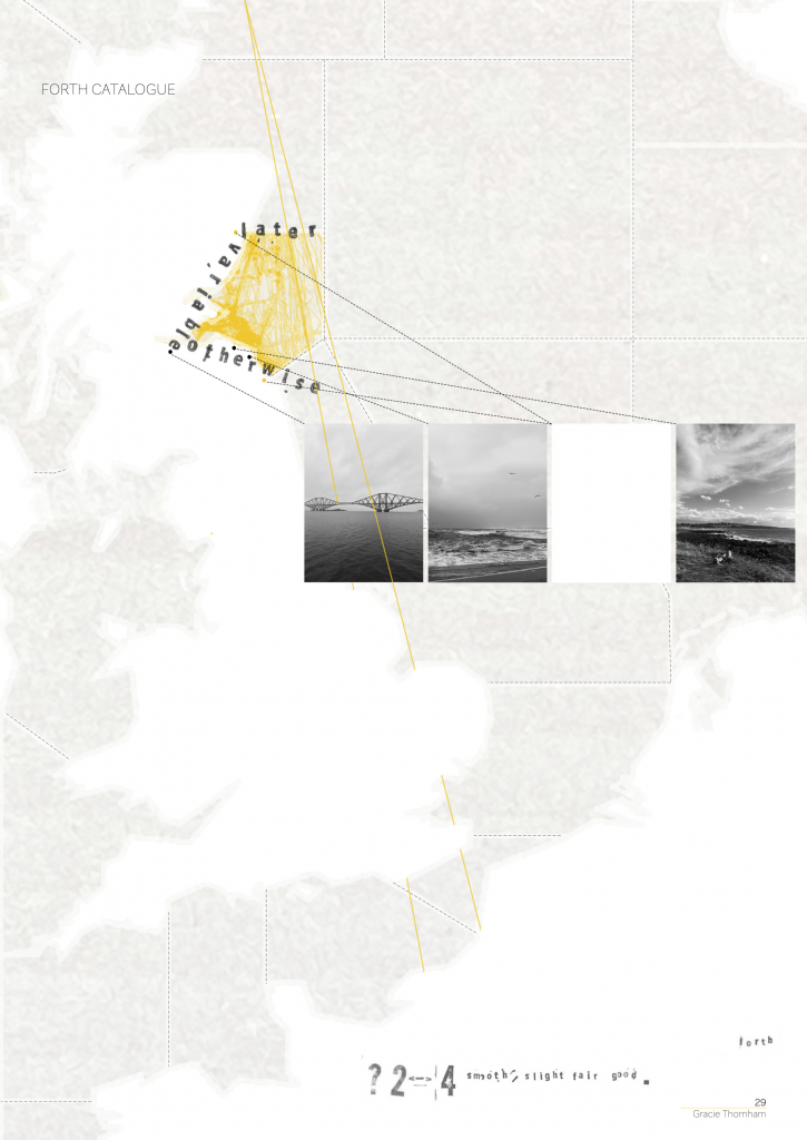
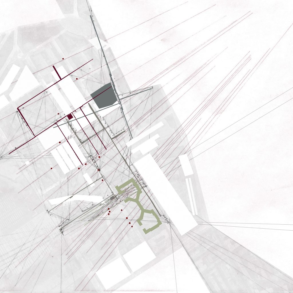
Discussions during the week one tutorial helped focus my method of cataloguing. Bridging was a key theme that arose in both methods of cataloguing. The defined lines in the sea area map bridged the expanse of the sea, and my index of the oral language acts as a bridge to contextualise the forecast. Bridging was the line of enquiry that guided my subsequent investigation.
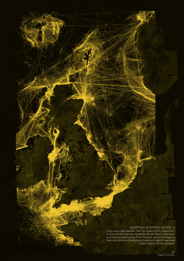
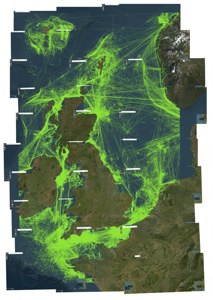
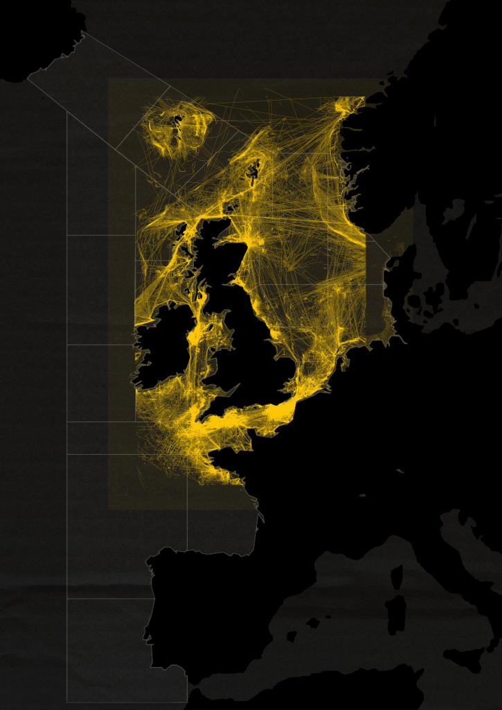
The Shipping Forecast is primarily utilised by small fishing vessels. The users of the forecast could not be overlooked in my method of cataloguing, therefore it felt apt to map these routes in relation to my research.
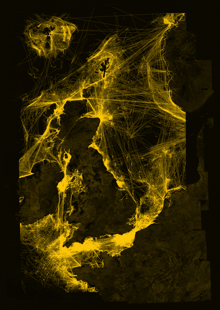
Using data made available from the Government’s Department for Environment (2019), I pieced together a full map of the routes of small fishing boats in the waters surrounding the United Kingdom in 2019. This was the most recent set of data made available to the public. I then translated this information to speak to the graphical style of my research so far, specifically utilising sou’wester yellow.
Fig. 1. Process of piecing together 2019 Shipping Vessel density data made available on Government’s Department for Environment (2019).
Fig. 2. Translating the map to speak to the visual language of my other methods of cataloguing.
Fig. 3. Overlaying The Shipping Forecast map over the fishing vessel density map.
The fishing vessel map felt at odds with The Shipping Forecast map. It is important to note that the official Government data about shipping routes does not span the entire distance of The Shipping Forecast. South Iceland, Bailey, Rockall, Shannon and Trafalgar were not included in the expanse of the shipping vessel map. Furthermore, the lines of the shipping vessel map cannot be confined to the distinct zones of The Shipping Forecast map. This further reinforced my line of questioning: ‘What happens when you cross over the boundary of sea area zones?’