Author: Gracie Thornham

  • Prompt Five

    PART ONE

    A statement that articulates how your group’s explorations helped you to reflect on, deepen, or shape your own position as a practitioner in context of climate justice and the UAL Net Zero plan (being as specific as possible).

    The group project has been an equally reflective and expansive personal exercise in shaping my own position as a practitioner in the context of climate justice. Following the end of the group project, I have pursed an individual investigation to deepen the critical commentary with an impetus to reach a greater level of cohesion and conclusion within the body of work.

    The exploration concerns itself with the critical question ‘Who can affordable to be sustainable? And at what cost?’. Through experimentation focused on world-building, the group iteratively developed speculative scenarios which reimagined UAL’s infrastructure for waste management in the future. The project sat at the intersection of architecture, place-making and communication design. The process has strengthened my own comprehension of the practical ways in which I can translate my architectural skillset into the field of communication design to promote social, political, or in this case, climate justice.

    I currently work for Boehm Lynas, a small architectural practice rooted in environmentally conscious design. In my daily work, I regularly encounter the language used within the UAL Climate Action Plan, but exclusively within an architectural context. The group project has consolidated my understanding of the jargon surrounding climate justice, and expanded my application of the terminology outside the field of architecture. 

    Within my professional work, I have a nuanced appreciation of the social, political and climate implications of urban design. Environmental concerns guide all aspects my architectural work, yet I had not extensively considered how this ethos may apply to my practice within graphic design. This oversight is arguably due to the disparity in the tangibility of environmental impact within urban versus graphic design. The discipline of architecture is confined within the parameters of environmental policy, whereas graphic design requires self-initiated adherence to Net Zero Targets.  

    The project has been an act of contextualising in itself; not merely in terms of the representation of the UAL Net Zero data, but as a critical reflection on my position as practitioner. The work has expanded my perception of my responsibility as a designer, as I transition from an architectural context into a interdisciplinary practice. 

    PART TWO

    An annotated bibliography consisting of 6 references that shaped your response to the brief, including: 

    2 texts from the reading list 

    2 texts that you find outside the reading list 

    2 design practices/projects.

    Berners-Lee. M. (2022) The Carbon Footprint of Everything. London: Profile Books.

    Although The Carbon Footprint of Everything (Berners-Lee, 2022) did not directly influence the outcomes of the group project, it was a vital text to develop our understanding of the wider theme of carbon emissions. Berners-Lee (2022) succinctly contextualises carbon emissions within everyday life, creating a robust foundational knowledge of the data. This reading was paramount to make the datasets more tangible. The text ensured my carbon literacy and enabled me to digest the statistics, and contextualise their qualitative size.

    Bertolotti-Bailey S. (2015) Towards a Critical Faculty (Only an Attitude of Orientation). Liverpool: The Serving Library.

    Stewart Bertolotti-Bailey’s (2015) Towards a Critical Faculty was an influential text within the Methods of Contextualising brief. The group wanted to effectively and critically challenge the role of UAL as an institution against the scale of the impact of decisions made by the individual. Our initial experimentation looked into the power structures and hierarchies within UAL, but without consideration on the relationship between the institution and the individual. This was not particularly successful as it disregarded the complexity of climate justice, and reduced the impacts into arbitrary categories. 

    Reflecting on Towards a Critical Faculty (Bertolotti-Bailey, 2015)encouraged a pivot in our thinking and refined our line of enquiry to more productively challenge the authority within UAL, whilst simultaneously retaining sensitivity towards the nuanced complexity of the subject. At this stage, we repositioned our project to create a critical line of enquiry that examined the role of the institution and the individual within the decisions made regarding waste management. 

    Calvino, I. (1972) Invisible Cities. Translated from the Italian by W. Weaver. London: Vantage Books.

    Italo Calvino’s (1972) Invisible Cities was arguably the most useful academic reference in the development of our critical investigation into UAL’s waste management under the proposed Net Zero Plan. Similarly to Anna Tsing’s (2020) Feral Atlas, Invisible Cities (Calvino, 1972) is centred around world-building, in this case within a literary context. The notion of creating a complex network of fictitious cities helped establish a framework for our own line of enquiry. The introduction of creating speculative worlds encouraged our group to iterate quickly, imagining the impact of UAL’s waste management strategy through the multiple different lenses. This research relinquished our thinking from the initial reductive experiments, which utilised chess as a metaphor to examine the data, and further contextualised our investigation in the complex network of dependencies within climate justice. 

    Eames, C. and Eames. R. (1977) Powers of Ten and the Relative Size of Things in the Universe [Film]. Eames Office, Los Angeles.

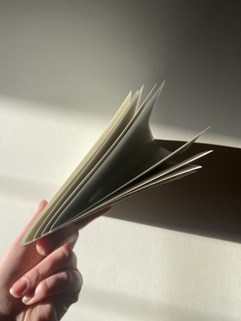
    Charles and Ray Eames (1977) astutely depict the relationship between scale and space through their film Powers of Ten. Throughout the group stage of the project, zooming was introduced as a critical tool to contextualise the scales of our world-building exercises. This was achieved through creating a folding publication, which zooms out in scale with each unfold. There was an motivation to put the micro scale of Central St Martins in conversation with the macro scale of the global impacts of UAL’s waste management. 

    The group exploration into zooming as a critical tool felt fairly rudimentary, therefore Powers of Ten (Eames, 1977) was revisited during my individual reflection of the project. Powers of Ten (Eames, 1977) was an important visual reference as it challenged the thinking around the medium in which the findings would be presented. The introduction of film unfixed the project from the staticity of the illustrations, and reframed the dialogue of the project into a space that could explore temporality, place-making and the scale of the social impact in one cohesive outcome.

    Matos, A. (2022) Who can afford to be critical?: An Inquiry Into What We Can’t Do Alone, as Designers, and Into What We Might Be Able to Do Together, as People. Eindhoven: Set Margins’.

    Phrasing our Methods of Contextualising exploration around a critical question allowed the work to be intentional and concise. Drawing inspiration from Who can afford to be critical? (Matos, 2022), we consolidated our initial research into the question of ‘Who can afford to be sustainable?’. The idea of affordability raises multiple different concerns that transcend above financial. We were collectively interested in the social and political repercussions of decisions. 

    The phrasing of our question was iteratively revised, to reflect the shift in our line of enquiry. We came to the critical question: ‘Who can afford to be sustainable? And at what cost?’. Afonso Matos’s (2022) Who can afford to be critical? was instrumental in the consolidation of our research, as the linguistic structure of the title of the book directly informed our method of approach to the group project. 

    The project concerns itself with the wider impacts of decisions made by both institution and individual within UAL, in an attempt to reveal, and challenge, the current systems of power and consequence. 

    Tsing, A. (2020) Feral Atlas. Available at:  https://feralatlas.org/ (Accessed: 18 February 2026).
    Feral Atlas (Tsing, 2020) successfully communicates the complexity of the ecological network, whilst maintaining the ease of the data consumption. The academic papers and statistics are hidden within a intricate index of ecologies, allowing the viewer to form their own journey through the platform as they access and interact with different data sets and information. Within the group project, there was an impetus to consider the viewer within the context of the work, and from the outset we imagined how the work could be meaningfully interacted with. 

    Feral Atlas (Tsing, 2020) acted as a key visual reference, due to the strong sense of world-building within the illustrative style. Within the graphics, space and scale are distorted, creating a speculative reality with a reordered hierarchy of ecologies. The themes of hierarchy, world-building and speculative realities remained central within our group exploration, as we critically investigated the role of the institution and the individual within a wider network of environmental and social consequences stemming from climate change.

    Similarly to Ray and Charles Eames’ (1977) Powers of Ten, Feral Atlas (Tsing, 2020) utilises zooming as a method to contextualise space and scale. The viewer is invited to enlarge the illustrations to reveal further details about the ecologies. This method of contextualising was touched upon within our group project, and further examined within my individual restructuring of the body of work. 

    Reference List:

    Berners-Lee. M. (2022) The Carbon Footprint of Everything. London: Profile Books.

    Bertolotti-Bailey S. (2015) Towards a Critical Faculty (Only an Attitude of Orientation). Liverpool: The Serving Library.

    Calvino, I. (1972) Invisible Cities. Translated from the Italian by W. Weaver. London: Vantage Books.

    Eames, C. and Eames. R. (1977) Powers of Ten and the Relative Size of Things in the Universe [Film]. Eames Office, Los Angeles.

    Matos, A. (2022) Who can afford to be critical?: An Inquiry Into What We Can’t Do Alone, as Designers, and Into What We Might Be Able to Do Together, as People. Eindhoven: Set Margins’.

    Tsing, A. (2020) Feral Atlas. Available at:  https://feralatlas.org/ (Accessed: 18 February 2026).
  • Manifesto! // Reflection

    Stephanie Jin’s cross year studio Manifesto! offered an opportunity to reflect on how my practice has developed since I started at CSM. The workshop felt aptly timed within the course calendar, as I have been taking time to critically reflect on what I have learnt during Unit: 1 Methods. The manifesto I produced during the cross year studio was a reflection on my understanding of my own positionality. I decided to illustratively convey my manifesto, rather than leaving it purely textual. It drew inspiration from Mill & Jones (2019) Exile’s Letter in both form and colour palette.

    My interest lies at the intersection between graphic communication design and architecture. Prior to this course I had not considered how that may materialise into a critical practice. 

    Throughout Methods of Investigating and Methods of Cataloguing I applied my architectural skillset onto the field of graphic design, with an impetus to communicate complexity through mapping. This cultivated a wider interest in the practice of social cartography, which I hope I can revisit in the future whilst studying at CSM. 

    The first two briefs primarily investigated architectural mapmaking as a graphic design tool. To further entangle the two disciplines of graphic design and architecture, I decided to translate an architectural theory onto a graphic design process during Methods of Translating. This was a pivotal moment in the development of the position of my practice, as I visually illustrated practical methods to intertwine my interests.

    After tentatively exploring my position as a designer in the first term, I began to break down the defined boundaries of graphic design and architecture within the Methods of Iterating project. Through the process of bookbinding conventional architectural drawings, the line between graphic design and architecture became even more blurred. I started to consider the disciplines as indistinct; I lost the ability to discern where graphic design finishes and architecture begins. 

    The Methods of Contextualising project aided the consolidation of my position as a designer. The speculative world building reflected my new-found understanding that architecture and graphic design are one in the same: where both disciplines are acts of world building, construction, communication, placemaking and speculation. I look forward to consolidating, warping and reimagining my position as a designer next semester. 

    Reference List:

    Mill, A. and Jones. L. (2019) Exile’s Letters. Oslo: Mill & Jones.

  • Reflection on the Project

    The group project addressed the critical question ‘Who can afford to be sustainable? And at what cost?’. The project can be accessed here.

    I have decided to develop the body of work further using the extra time provided from my adjusted deadline. I am interested in the line of enquiry that emerged during the project. I will explore the critical questions that the project addressed more thoroughly. Through a more detailed analysis of UAL’s waste strategy, I have attempted to weave together the threads of the group project. This restructured and developed body of work can be found here.

  • Group Body of Work

    Our space and scale project analytically examines “Who can afford to be sustainable? And at what cost?”. Following a meticulous dissection of UAL’s Net Zero Plan, we decided to focus our investigation on the current waste management strategy. The project explores the tension between the institution’s and the individual’s role in creating realised improvement within the waste sector. We aimed to constructively challenge the current infrastructure as laid out by UAL’s Net Zero Team, questioning the complex interplay between systemic institutional change and cooperation from the individual.

    Zooming was utilised as a critical tool to examine our work as we transferred between different spaces and scales. The introduction of zooming enhanced our enquiry as it initiated a further dimension of temporality into our work, whilst prioritising interactivity and self-guided discovery for the audience.

    Drawing inspiration from Italo Calvino’s (1972) Invisible Cities, speculative world-building became a lens to understand the future of UAL’s waste management. Through the practice of placemaking, we imagine how UAL could operate within the fictitious environments created: a speculative post-internet world, a speculative post-war world, a speculative world where landfill no longer exists, and, a speculative world where The Green Party is in power.

    In an attempt to utilise graphic design to visualise scales of influence and impact, there was an ongoing impetus to communicate complexity. The fundamental understanding of the scale of the chain reaction cause by a singular decision within UAL’s waste management system underpins the entire body of work. The notion of a ripple effect guided the formation of the chapters, where each section builds upon the knowledge created in the previous. Following the same system of a network of dependencies, an index is created to categorise the project guided by the terms; context, contextual, contextualising, contextualisation.


    Within the following document, our names are listed on the bottom left of the page. These are highlighted to reflect the different group members that contributed to the work on the respective page.

    Reference List:

    Calvino, I. (1972) Invisible Cities. Translated from the Italian by W. Weaver. London: Vantage Books.

    Eames, C. and Eames. R. (1977) Powers of Ten and the Relative Size of Things in the Universe [Film]. Eames Office, Los Angeles.

    Matos, A. (2022) Who can afford to be critical?: An Inquiry Into What We Can’t Do Alone, as Designers, and Into What We Might Be Able to Do Together, as People. Eindhoven: Set Margins’.

    Meure, E. (2025) Material Circularity at UAL. Available at: https://www.arts.ac.uk/__data/assets/ pdf_file/0033/477618/Material-circularity-sum- mary-report-2025.pdf (Accessed: 22 February 2026).

    Tsing, A. (2020) Feral Atlas. Available at:  https://feralatlas.org/ (Accessed: 18 February 2026).
  • Week 1 & 2 Process

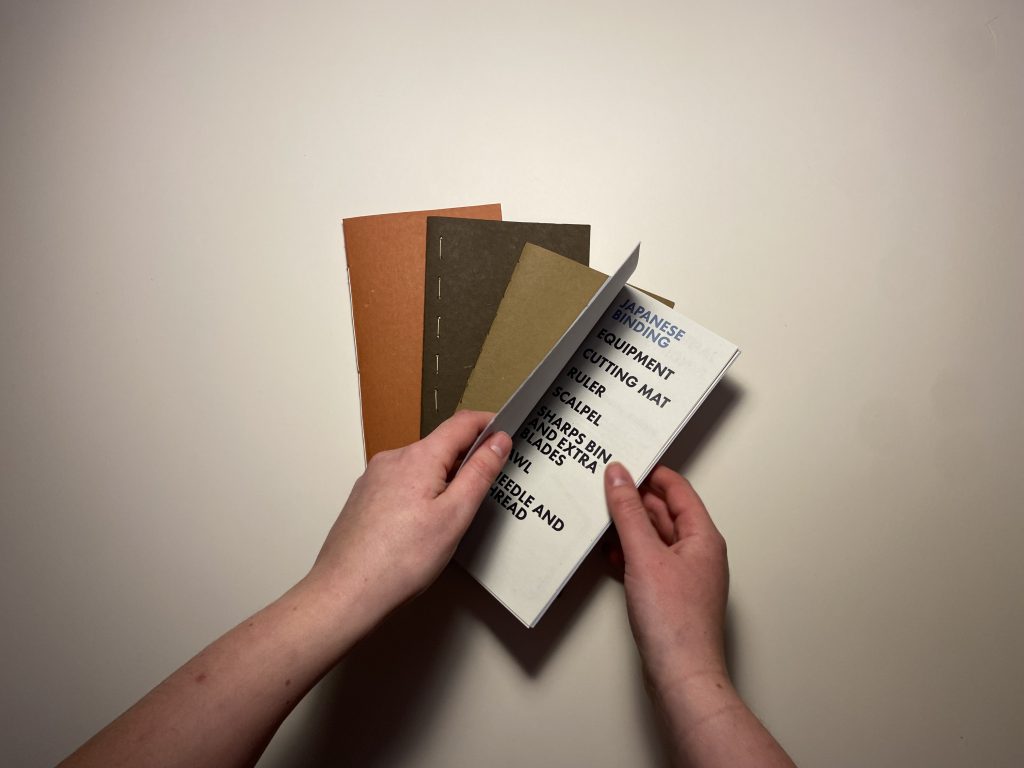
    The language surrounding bookbinding has guided my iterative experimentation into three distinct chapters. The first chapter looks at ‘The Bind’. This body of work is characterised by building foundational knowledge about specialist bindings, specifically Singer Sewn, Side Sewn, Japanese Binding and Three Hole Sewn.

    Fig. 1. Exploration guided by ‘The Bind’.

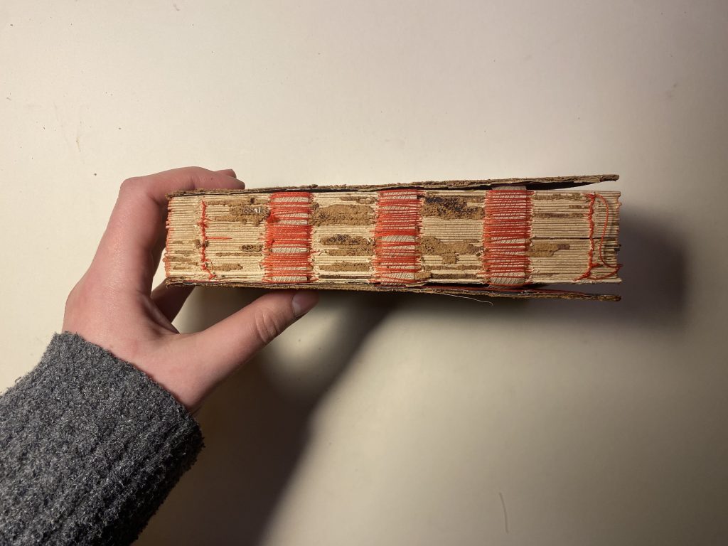
    The second chapter investigates the role of ‘The Binder’ more thoroughly. The binder is often overlooked within the practice of bookbinding, which is being exacerbated by the growth of industrial book manufacturing. The trace that the binder once would have left from their craftsmanship is being standardised, automated, and consequently, eradicated.

    Fig. 2. Exploration guided by ‘The Binder’.

    The third chapter engages with the concept of ‘The Bound’. The term ‘bound’ has many different meanings. The definitions of relevance to this project are:

    1. ‘a territorial limit; a boundary’

    2. ‘going or ready to go towards a specified place’

    3. ‘past and past participle of bind’.

    I investigated what processes are bound within bookbinding (according to the second definition of the word).

    Fig. 3. Exploration guided by ‘The Bound’.

    The language surrounding my work has helped to iteratively rephrase the critical questions I am attempting to answer throughout my studio project.

  • Week 4 Process

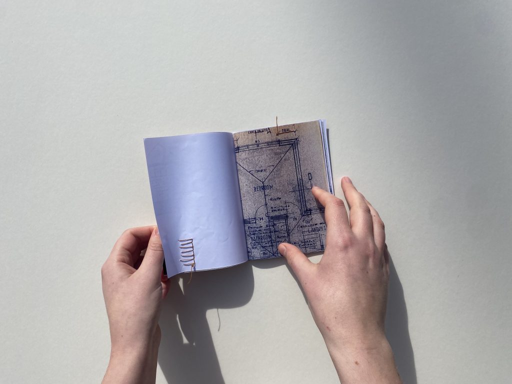
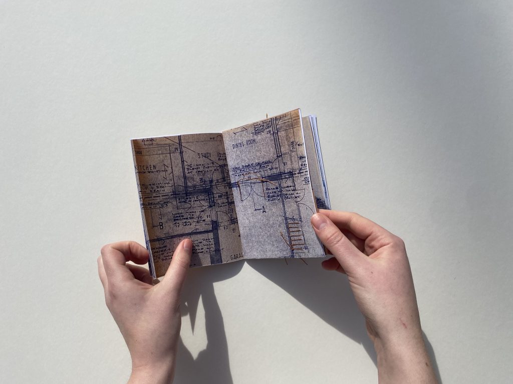
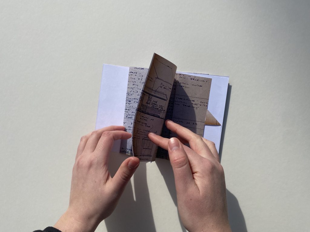
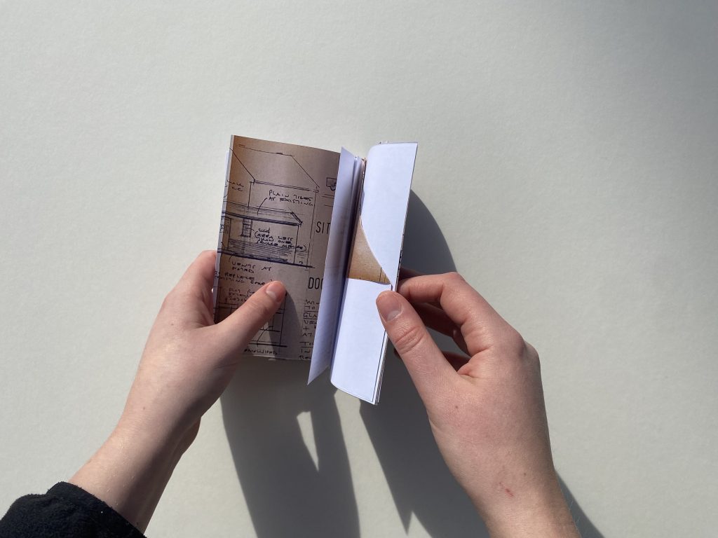
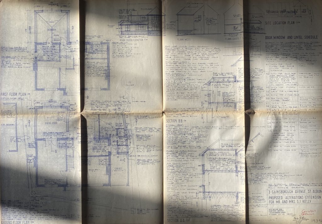
    Working quickly and intuitively, 12 iterations were created by binding the architectural drawings of my family home under the lens of the selected terms; constraint, trace, trace, sequence and friction.

    This blog post acts as a catalogue of the iterative experiments into the bound outcomes within bookbinding.

    CONSTRAINT

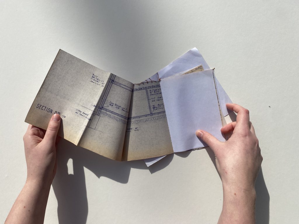
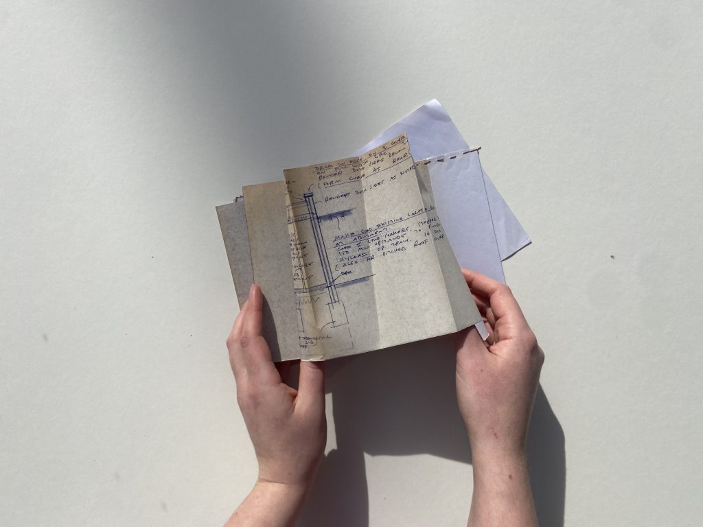
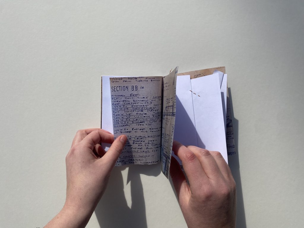
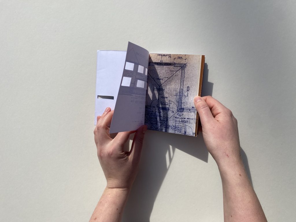
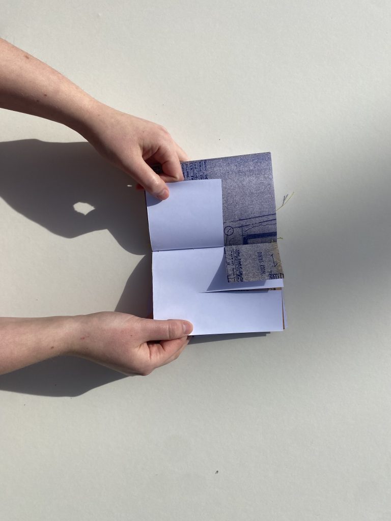
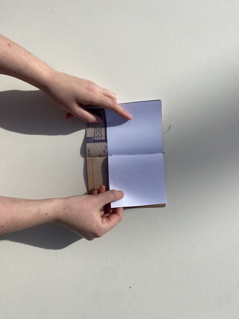
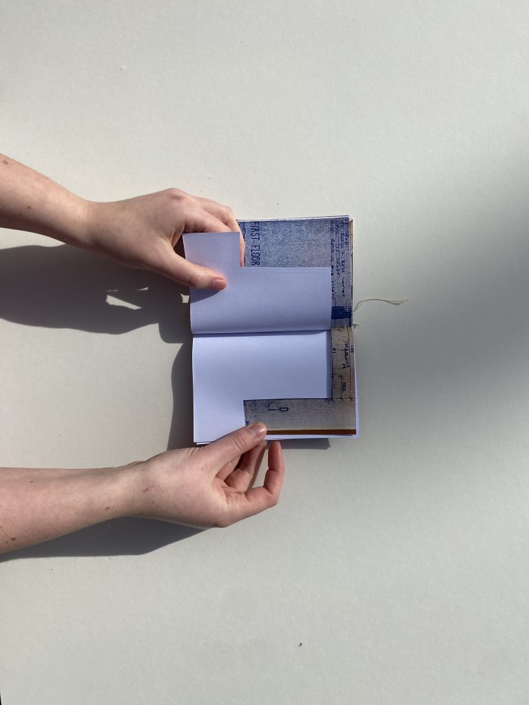
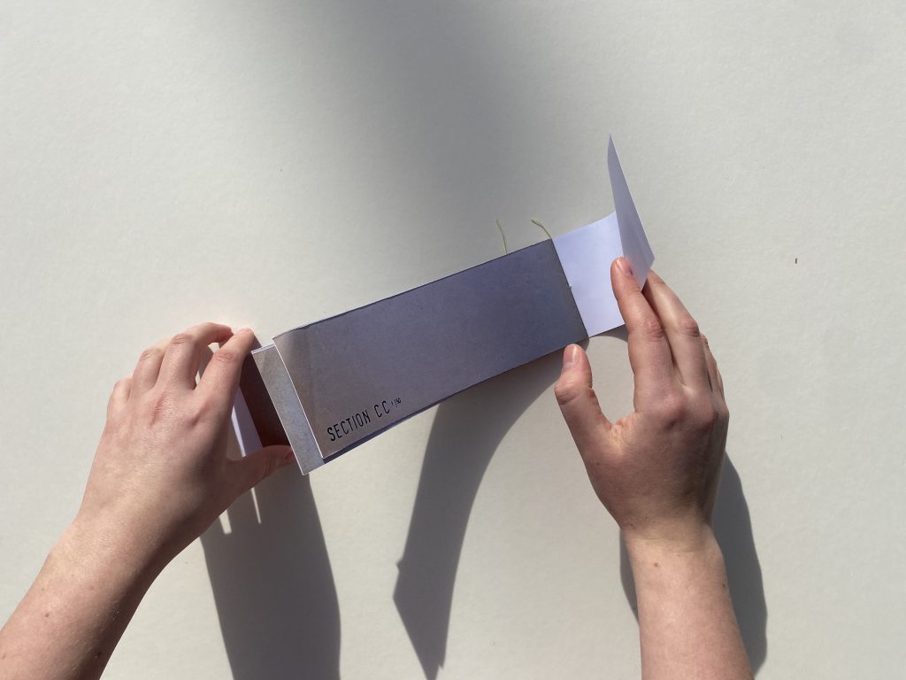
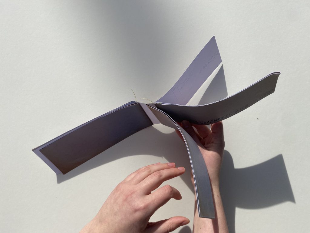
    The first set of experiments looked into the term constraint. Here, the pages were folded and bound so that the sectional drawings were partially concealed, forcing the reader to engage more deeply with the object to view the content.

    The second iteration saw the binding following moments of constraint within the architecture of the home, as well as the architectural notation. Dimensions on the drawing are bound, as they cannot be changed, therefore they are amplified here within the binding itself.  

    Similarly to the first experiment, this interpretation of constraint focused on the folding of the paper to constrain the knowledge that was visible. The notion of constraint was stitched into the investigation as the binding followed fixed architectural elements, such as the roofline of the building.

    TRACE

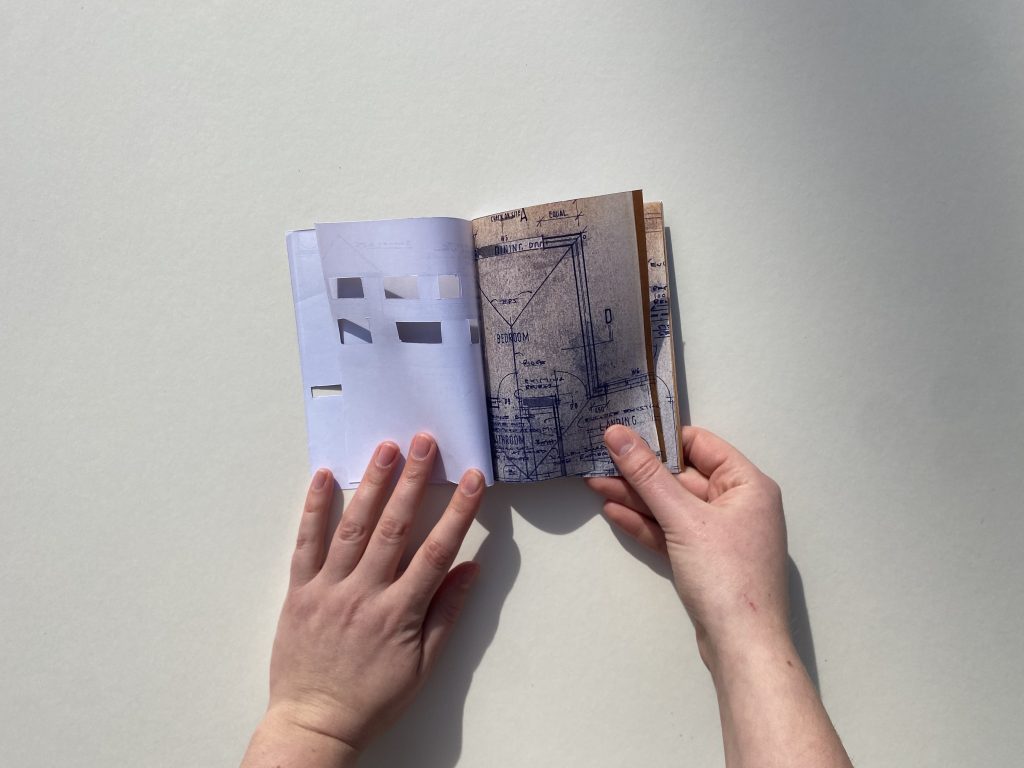
    Building upon the techniques used in the first set of iterations, this experiment exclusively bound the drawings together along the spaces within the home that my family have altered since moving in. Trace of human life, and our own experience of the house, has fuelled this trial. 

    Similarly to the previous investigation, this iteration adopts a similar methodology, albeit looser. This means that the binding is not so rigid and is further away from our understanding of conventional bookbinding practices.

    Within architecture, trace has an alternate meaning which can be defined by  the  structure used to subdivide windows into sections. In this spirit, this  inquiry focuses on tracing the locations of the windows in plan onto over  areas of the building.

    SEQUENCE

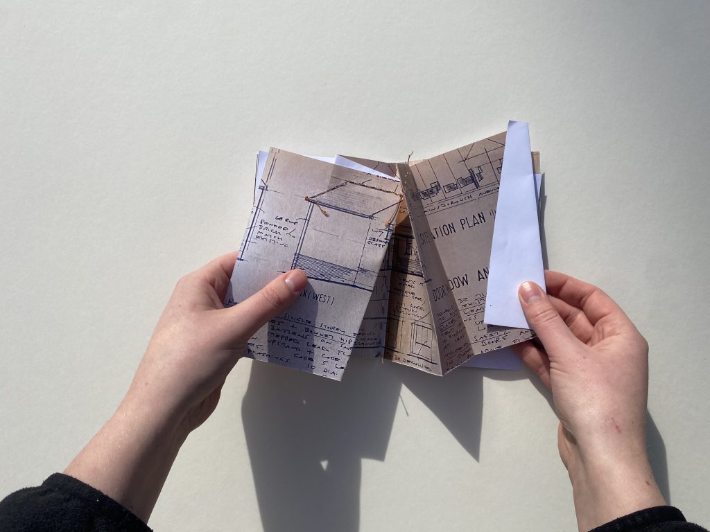
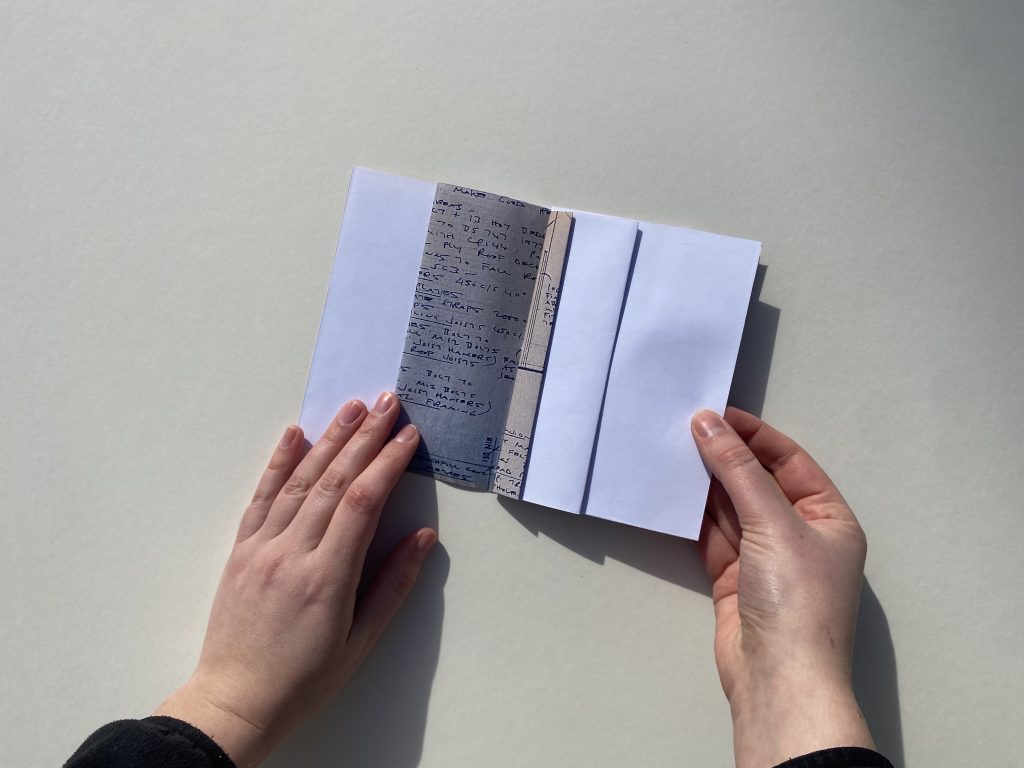
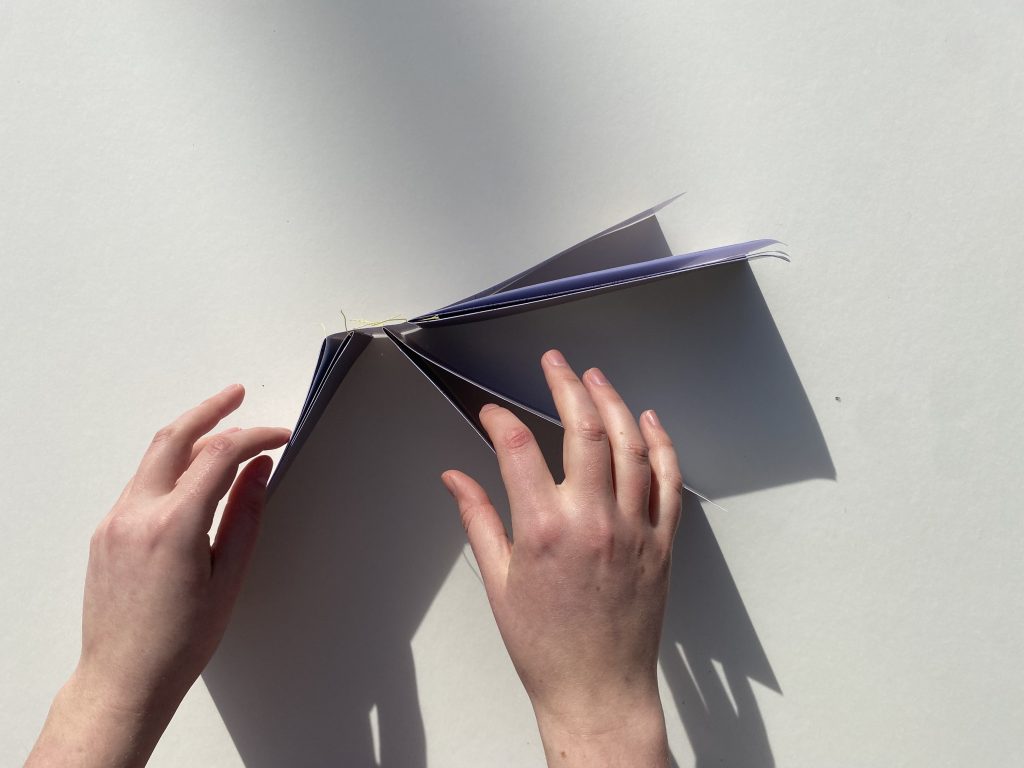
    Folding is a key process within bookbinding, and heavily alters the readers experience of the book. The folding of this publication sequences the information, concealing large portions of the drawings.

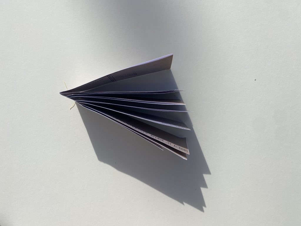
    Interpreting the term more literally, this trial sequentially binds together the pages of the booklet in a concertina format. 

    Within architecture, sequence is defined by the ordered progression of spaces, experiences or elements within a building. This iterative investigation follows the natural entrance sequence around my family hone, initially entering at the front door, moving through the ground floor, then traversing the stairs and exploring the first floor. The binding of the architectural plan amplified this sequential journey through the space.

    FRICTION

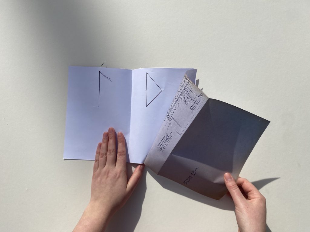
    The first iteration looked into the friction caused by the process of binding itself. A three hole sewn technique was used to bind the pages together. The publication was subsequently taken apart and put back together ten times, revealing the friction caused by the process. 

    The second version of friction sliced the pages along lines that correlated to friction within the architecture, such as level changes, external boundaries and roof eaves.

    The final iteration creates friction as the pages are turned, as the binding is displaced every few pages. The booklet does not turn easily, creating friction between the object and the reader. 

  • References

    Paul Bailey delivered an exceptional cross year studio, focused on the theme Text & Writing. We were tasked with three quick exercises, which explored who we are in conversation with, through our projects and practices. Ahead of the session, we were asked to select ten key references that are influencing our current practice, alongside a brief statement about the impact they have on our work.

    Banham, R. (1955) ‘The New Brutalism,’ The Architectural Review, 118 (708), pp. 335-361. 

        The architectural theory proposed by Reyner Banham in ‘The New Brutalism’ (1955) was translated into the field of type design in my previous studio project. 

        Rams, D. (2021) Ten Principles for Good Design. Munich: Prestel Publishing.

          A key text which is guiding current experimentation into whether design can be both honest and unobtrusive. 

          Fenner Paper. (2009) Size, Format, Stock. Tonbridge: Fenner Paper.

            This publication is the starting point for my current studio project which is reflecting on the skill and craftsmanship of bookbinding.

            Gysin, B. and Boroughs. W. (1978) The Third Mind. New York: The Viking Press.

              This text is a reflection on techniques introduced by William Boroughs. His cut-up technique has been adopted and reimagined within my iterative exercises to resequenced the bookbinders tools.

              McLachlan, F. et al. (2015) Colour Strategies in Architecture. Translated by I. Boyd White. Basel: Farbstrategien in der Architektur. 

                My interest lies as the intersection between architecture and communication design. Colour Strategies in Architecture explores graphical representations of conventional architectural concepts.

                Steyerl, H. (2012) ‘In Defense of the Poor Image’ in The Wretched of the Screen. Berlin: Sternberg Press, pp. 31-45. 

                  The writing style of Steyerl is accessible, yet the fundamental arguments are vastly complex and interwoven into topical social issues.

                  Mill, A. and Jones. L. (2019) Exile’s Letters. Oslo: Mill & Jones.

                    Exile’s Letters is another example of interdisciplinary design, with a focus on both graphics and architecture. There is strong relation between the text and illustrations.

                    Forensic Architecture. (2024) The Grenfell Tower Fire: Situated Testimonies. Available at:  https://forensic-architecture.org/investigation/the-grenfell-tower-fire-situated-testimonies (Accessed: 25 January 2026).
                      The practice has a continues and sustained influence over my practice, as they perfectly marry architecture and graphic design with a focus on social justice. 

                      Anderson, B. (2006) ‘Census, Map, Museum’ in Imagined Communities. London: Verso, pp.163-185. 

                        This was a key text that is presentative of a turning point within my own writing, as I grasped the concept of creative writing within the field of graphic communication design. 

                        Tsing, A. (2020) Fetal Atlas. Available at:  https://feralatlas.org/ (Accessed: 25 January 2026).
                          Anna Tsing reimagined collective idea around what academic literature is, with the illustration and composition of the atlas guiding the user to different article and journals.

                          FIRST EXPERIMENT

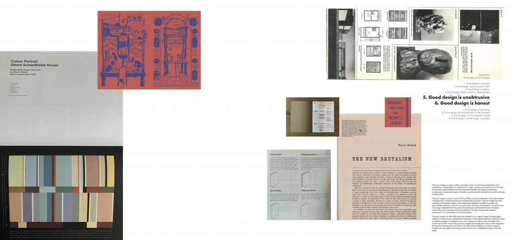
                          The first experiment challenged us to create a tableau with pages, clippings, extracts, photographs and diagrams from our selected references.

                          Fig. 1. Tableau created to illustrate key references that are currently influencing my work.

                          SECOND EXPERIMENT

                          The second experimented turned the focus into creating a slideshow of key extracts of text. I decided to put the texts in conversation with one another by introducing new references on the right side of each slide. 

                          Fig. 2. Slideshow created to guide viewer through important passages of the selected references.

                          THIRD EXPERIMENT

                          The third experiment refined the notion of putting the references in conversation with one another by pulling out key words that reoccur across the texts. 


                          The workshop with Paul Bailey was a practical approach to identify and reflect on the references that are currently influencing my work. Each piece of writing that I consume acts as a footnote within my life and helps mould my creative practice.

                          Reference List:

                          Anderson, B. (2006) ‘Census, Map, Museum’ in Imagined Communities. London: Verso, pp. 163-185. 

                          Banham, R. (1955) ‘The New Brutalism,’ The Architectural Review, 118 (708), pp. 335-361. 

                          Fenner Paper. (2009) Size, Format, Stock. Tonbridge: Fenner Paper.

                          Forensic Architecture. (2024) The Grenfell Tower Fire: Situated Testimonies. Available at:  https://forensic-architecture.org/investigation/the-grenfell-tower-fire-situated-testimonies (Accessed: 25 January 2026).
                          Gysin, B. and Boroughs. W. (1978) The Third Mind. New York: The Viking Press.

                          McLachlan, F. et al. (2015) Colour Strategies in Architecture. Translated by I. Boyd White. Basel: Farbstrategien in der Architektur.

                          Mill, A. and Jones. L. (2019) Exile’s Letters. Oslo: Mill & Jones.

                          Rams, D. (2021) Ten Principles for Good Design. Munich: Prestel Publishing.

                          Steyerl, H. (2012) ‘In Defense of the Poor Image’ in The Wretched of the Screen. Berlin: Sternberg Press, pp. 31-45. 

                          Tsing, A. (2020) Fetal Atlas. Available at:  https://feralatlas.org/ (Accessed: 25 January 2026).
                        1. Prompt Four

                          DRAFT ONE

                          While you’re working on your copy, articulate (in writing) the key critical questions that emerge through this exploration. Discuss how the project that you’re copying raises these questions and write a proposal for a studio-based experiment that would allow you to explore them further.

                          The initial copying exercise saw a recreation of aspects of ‘Size, Format, Stock’ produced by Fenner Paper and Studio8 Design (2009). The publication was included within the Bookbinding Toolkit, provided by Central St Martins to every MA Graphic Communication Design student. The information within the publication was manipulated and divided into four explorations, each looking at a distinct bookbinding process. Elements of the graphical style of the Fenner Paper (2009) infozine were replicated, and the simple illustration style was adopted to visually represent the binding processes.

                          The iterative exercise of copying raised critical questions about the hidden labour of bookbinding. The craftsmanship and skill required for bookbinding cannot be seen in the final output, as the labour is concealed within the spine and gutter. Moreover, the bookbinders toolkit leaves no trace, thus exacerbating the elusiveness of the binder. This raised further questions about what is seen and what is left unseen. ‘Size, Format, Stock’ (Fenner Paper, 2009) does not address the handcraft aspect of bookbinding, and the binder themselves remains out of the conversation. Is a successful bookbind one that has no trace? 

                          Dieter Rams’s ‘Ten Principles for Good Design’ (2021) suggests that ‘good design is unobtrusive’. Within the field of bookbinding, this seems to be the desired outcome. This notion of design being inconspicuous sits at odds with Rams’s sixth principle; that ‘good design is honest’. Can design be both unobtrusive and honest? How does this translate into the process of bookbinding?

                          It is impossible to uproot ‘Size, Format, Stock’ (Fenner Paper, 2009) from its original context; the Bookbinding Toolkit. Shared knowledge of bookbinding is therefore considered as a critical tool within the Bookbinding Toolkit. In an attempt to create honest design, the studio-based experiment will focus on revealing the tools that are used within the process of bookbinding. This process will attempt to unravel the fixed notions of bookbinding, and rebuild the process with an emphasis on celebrating the craftsmanship of the binder.

                          DRAFT TWO

                          Identify a reference from the reading list that you can use as a lens through which to view and analyse your project. Then create a second draft of your writing that advances your enquiry in response to this new context.

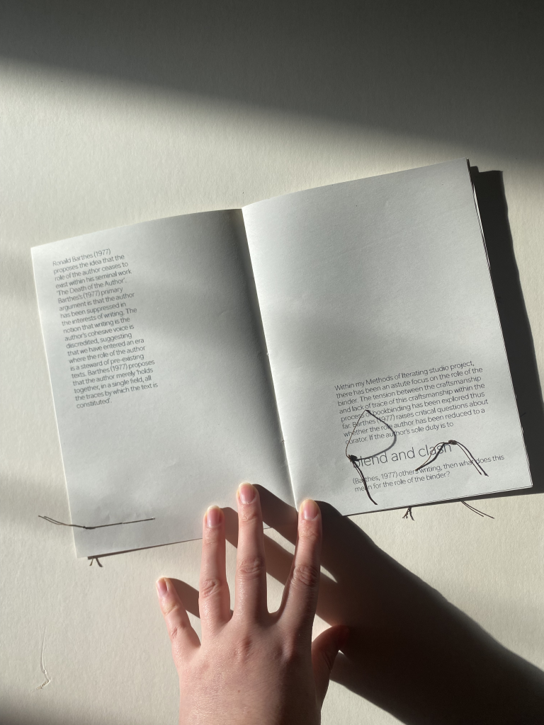
                          Ronald Barthes (1977) proposes the idea that the role of the author ceases to exist within his seminal work ‘The Death of the Author’. Barthes’s (1977) primary argument is that the author has been suppressed in the interests of writing. The notion that writing is the author’s cohesive voice is discredited, suggesting that we have entered an era where the role of the author is a steward of pre-existing texts. Barthes (1977) proposes that the author merely ‘holds together, in a single field, all the traces by which the text is constituted’.

                          Within my Methods of Iterating studio project, there has been an astute focus on the role of the binder. The tension between the craftsmanship and lack of trace of this craftsmanship within the process of bookbinding has been explored thus far. Barthes (1977) raises critical questions about whether the role author has been reduced to a curator. If the author’s sole duty is to ‘blend and clash’ (Barthes, 1977) others writing, then what does this mean for the role of the binder? 

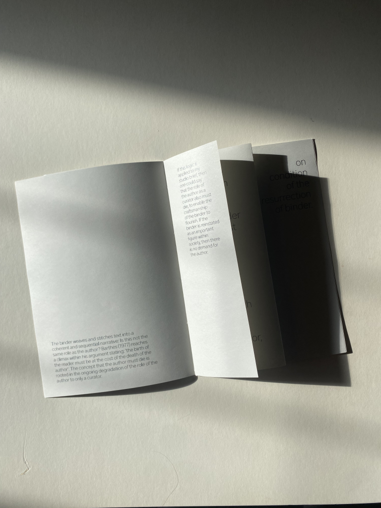
                          The binder weaves and stitches text into a coherent and sequential narrative: Is this not the same role as the author? Barthes (1977) reaches a climax within his argument stating: ‘the birth of the reader must be at the cost of the death of the author’. The concept that the author must die is rooted in the ongoing degradation of the role of the author to only a curator. If this logic if applied to my studio brief, then one could say that the role of the author as a curator also must die, to enable the craftsmanship of the binder to flourish. If the binder is reinstated as an important figure within society, then there is no demand for the author.

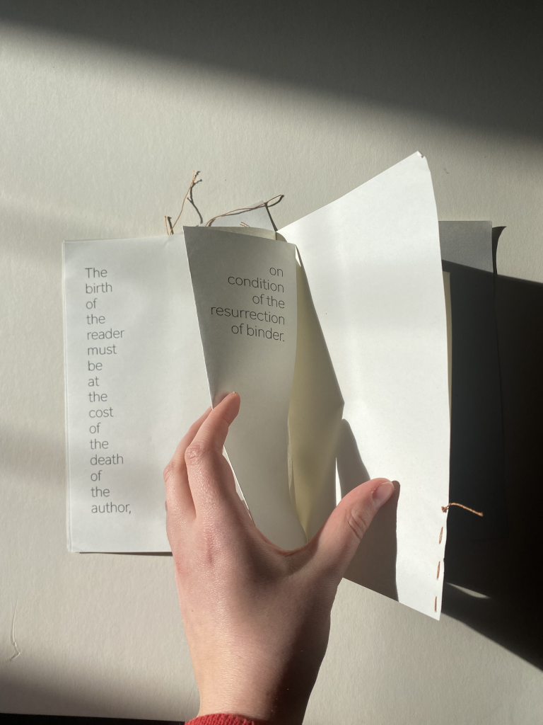
                          The birth of the reader must be at the cost of the death of the author, on condition of the resurrection of the binder.

                          Furthermore, Barthes (1977) highlights that ‘in the multiplicity of writing, everything is to be disentangled, nothing deciphered’. Writing has become a linear expression of an interwoven mesh of others ideas. If this were not the case, how would the reader decipher the writing? If knowledge is not granted, then the text will be constrained. The reader will have to understand, scrutinise and interpret the writing for themselves. The notion of constraint is a key theme explored within my studio project, Methods of Iterating. The process of binding conceals and reveals different aspects of the information shared; a constraint on knowledge. 

                          DRAFT THREE

                          For the third draft of your written response, render your text using the tool or medium that you’ve been exploring during this project. This is both a visual and intellectual exercise. How does the text and its meaning change when you translate it in this way?

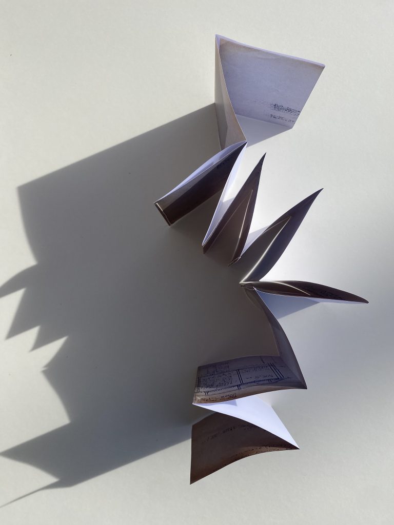
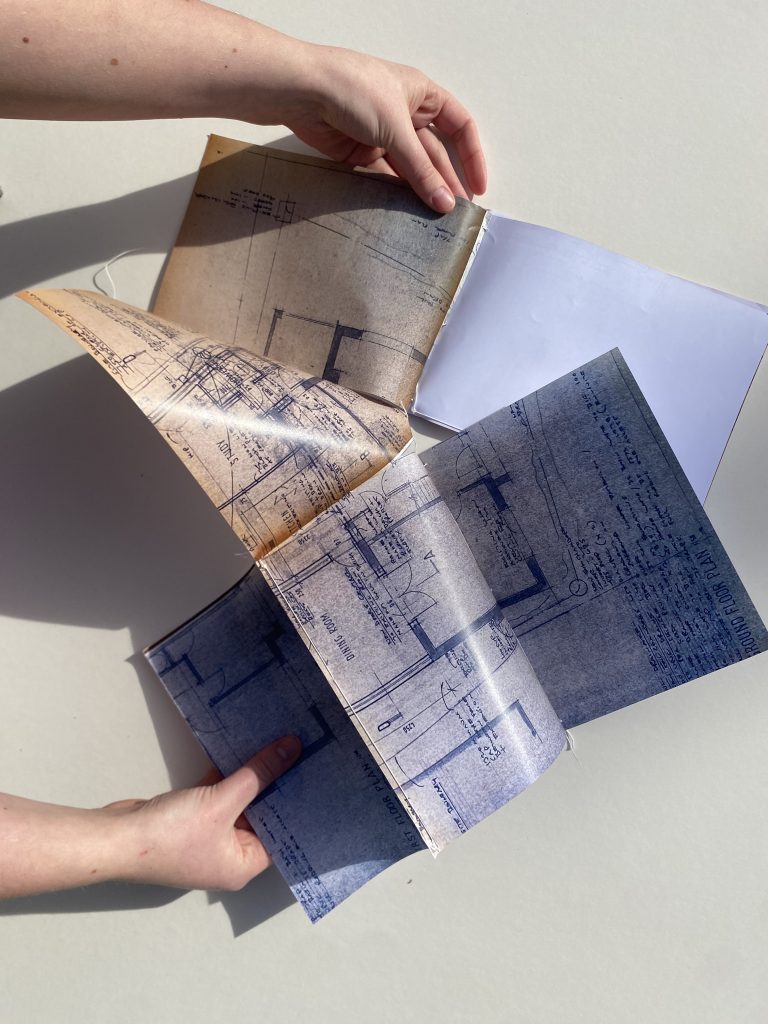
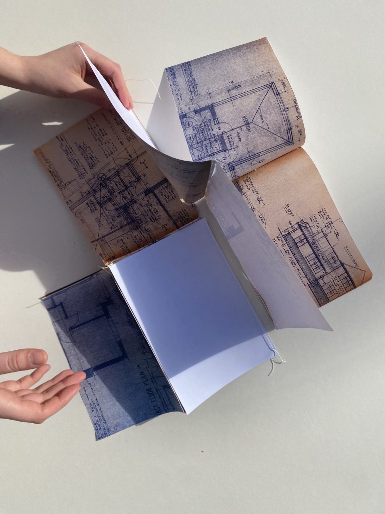
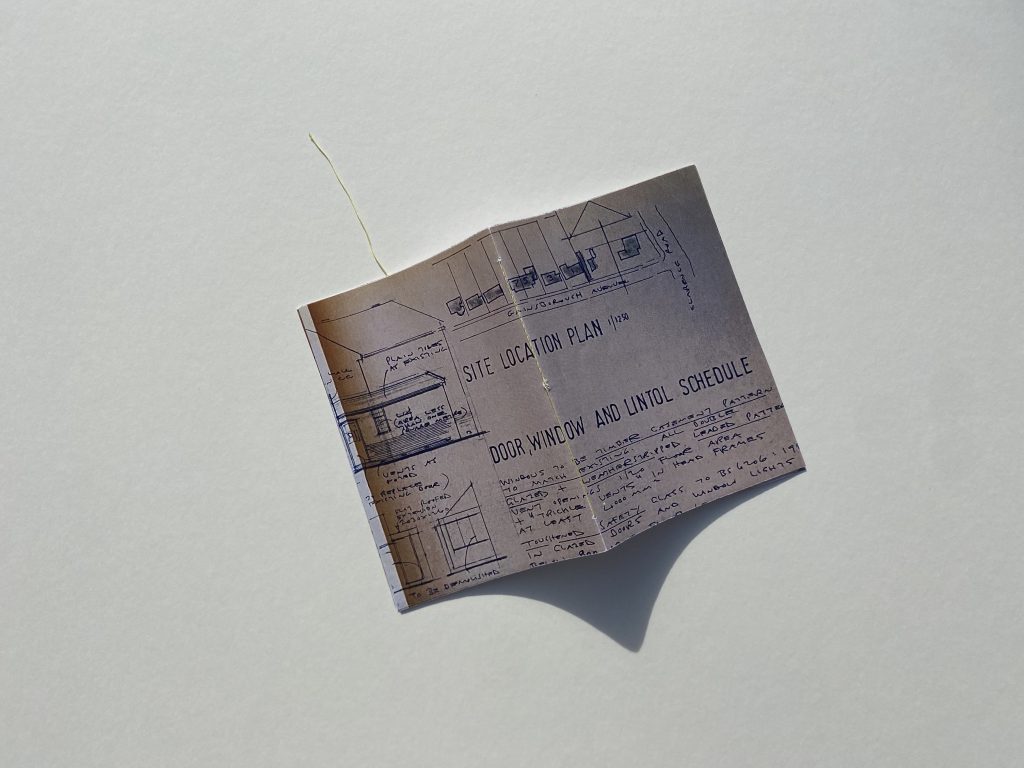
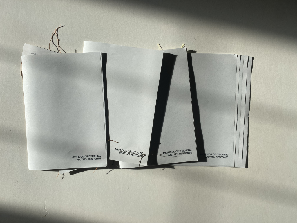
                          Fig. 1. The four iterations of my rendered text, each correlating to the terms I discovered to be bound outcomes within the process of bookbinding.
                          Fig. 2. Constraint
                          Fig. 3. Trace
                          Fig. 4. Sequence
                          Fig. 5. Friction.

                          For the third draft of my written response, I rendered the second draft of text using the process of bookbinding. Similarly to all my other experiments through the Methods of Iterating project, the binding process exclusively used the equipment included within the CSM Bookbinding Toolkit. 

                          The text was stitched together four times, each correlating to the terms which I have discovered to be bound within the process of bookbinding: constraint, friction, sequence and trace. This iterative experiment plays with the parameters that define bookbinding, disturbing with the readability of the text as different elements are concealed and revealed. 

                          The rendering reinforces the notion that constraint, friction, sequence and trace are bound outcomes within bookbinding, whilst simultaneously scrutinising the meaning of these terms. The fixed outcomes have been reimagined to produce a binding that is no longer conventional. Does that these outcomes are no longer bound?
                           

                          Reference List:

                          Barthes, R. (1977) ‘The Death of the Author’ in Image, Music, Text. London: Fontana Press, pp. 143-148.

                          Fenner Paper. (2009) Size, Format, Stock. Tonbridge: Fenner Paper.

                          Rams, D. (2021) Ten Principles for Good Design. Munich: Prestel Publishing.

                        2. Week 3 Process


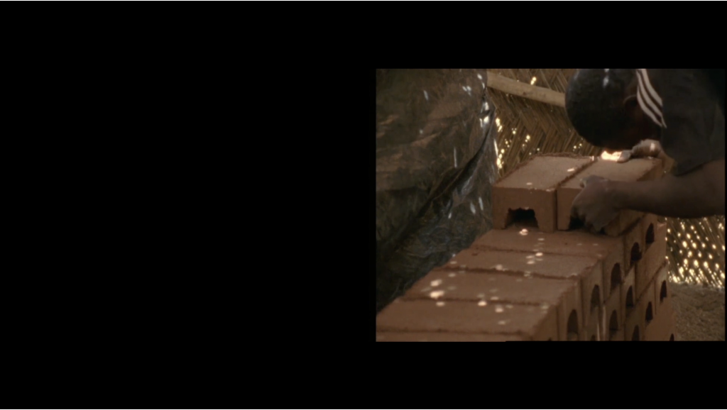
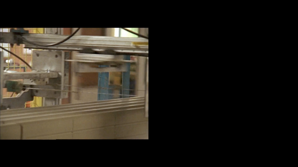
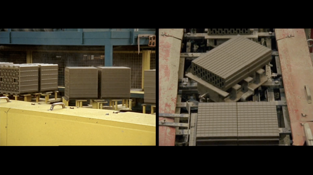
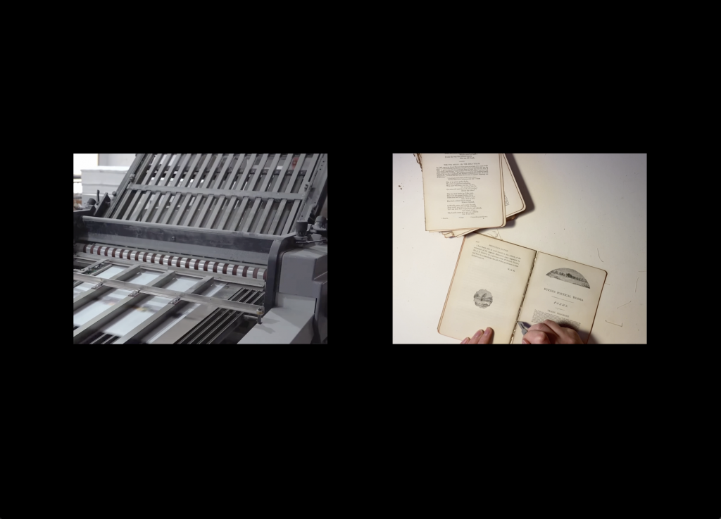
                          Harun Farocki’s (2009) In Comparison served as a key reference within my studio project. Farocki’s split screen video documents the procurement of clay bricks across Burkina Faso, Germany, France, Austria, India and Switzerland. The work is a commentary on the disparity of global labour, with the footage illustrating industrial material manufacturing in direct conversation with manual, labour-intensive processes. 

                          Fig. 1. Stills from Harun Farocki’s (2009) In Comparison.

                          Within the context of bookbinding, there is a vast variance between modern, automated book production, versus traditional craftsmanship. The role of the binder is quickly becoming eradicated as factory procurement is becoming more favourable. The art of bookbinding is under serious and immediate threat.

                          Reflecting the form of Harry Farocki’s (2009) In Comparison, I set out to create a split screen video representing my own experience of the bookbinding process. I juxtaposed by own documentation of dismantling and restitching a book from 1905 against the automated process documented in SatisFactory Press’s (2024) Youtube video The Fascinating Mass Production Process of Books in a Chinese Factory. The audio was spliced and overlayed on top of the videos, creating tension between the two processes. The outcome was uncomfortable and distressing as it illustrated the scale of mass produced books, as well as the threat for the existence of the hand bookbinder.

                          To access the split screen video please click on the image above or follow the link below:

                          https://vimeo.com/1163076639?share=copy&fl=sv&fe=ci

                          Reference List:

                          Farocki, H. (2009) In Comparison [Video]. Tate: Liverpool.

                          SatisFactory Process (2024) ‘The Fascinating Mass Production Process of Books in a Chinese Factory.’ 

                          Available at: https://www.youtube.com/watch?v=WGcqyR2hK_w