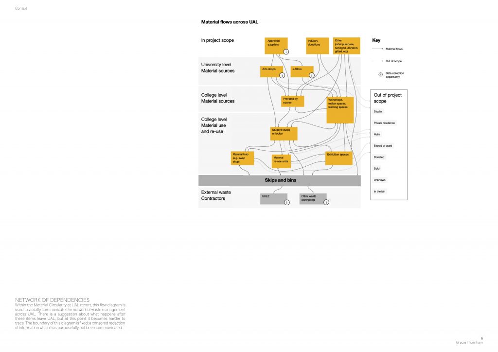
A short statement that articulates your line of enquiry. What questions are you exploring in this project, and how are you exploring them?
Position: a particular way in which someone or something is placed or arranged.
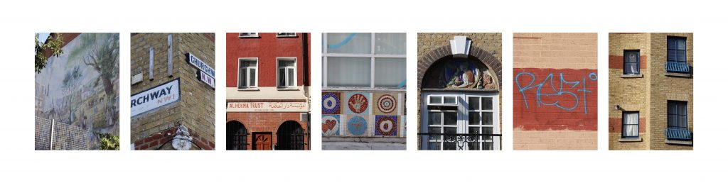
Palimpsest within the built environment will be employed as both a subject matter and a method for investigation to uncover the layers of history embedded within our urban fabric. I will explore the tension between the degradation of the image and the degradation of the building. When does a structure become so degraded that the landscape and the built environment become indiscernible?
Position: a place where someone or something is located or has been put.
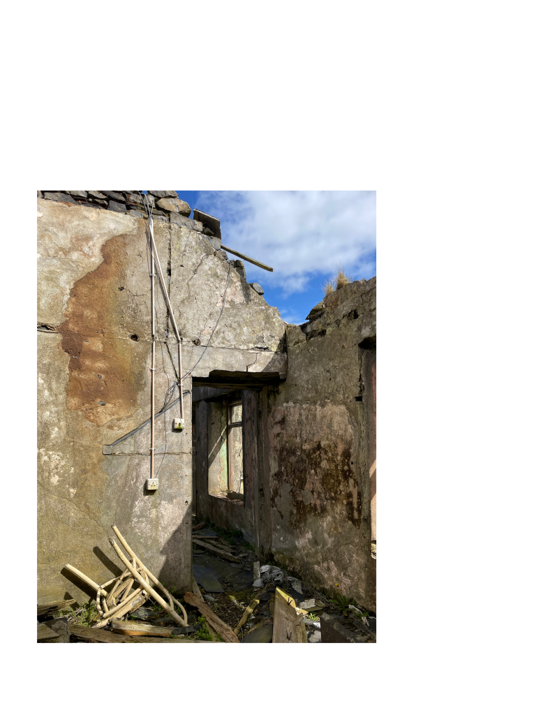
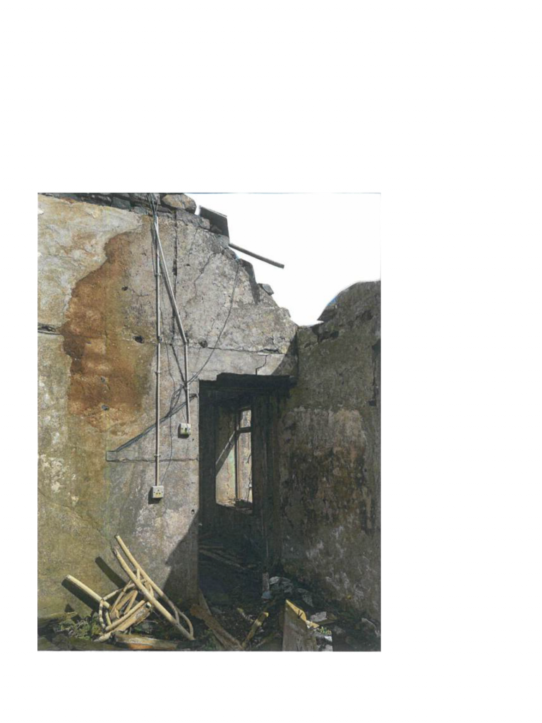
My line of enquiry will initially investigate the rural west coast of Ireland and the derelict homestead dwellings that populate the land. I intend to create a system of understanding the past and future of these structures, using palimpsest as a lens.
Position: a person’s point of view or attitude towards something.
The acknowledgement of my ethnographic positionality is essential as I disentangle the history of the west coast of Ireland, and my own personal relation with it. Drawing inspiration from Georges Perec’s (1999) ‘Species of Spaces’, I will explore the experience of ageing through place, memory and writing. Although my research starts at the west coast of Ireland, my work will not be limited by geographical location. Can palimpsest (as a subject matter and method) be applied to other built environments to glean insight into the history of the place? And how can this research be circulated?
A small annotated bibliography of 6 references that
help you to situate this project in wider contexts.
Crow, T. et. al. (2003) Gordon Matta-Clark. London: Phaidon Press Limited.
(reference that is specifically related to your project in its topic (theme or subject matter))
‘I think Gordon’s were also a reaction against the overbearing use of architecture as an icon’ (Crow, 2003).
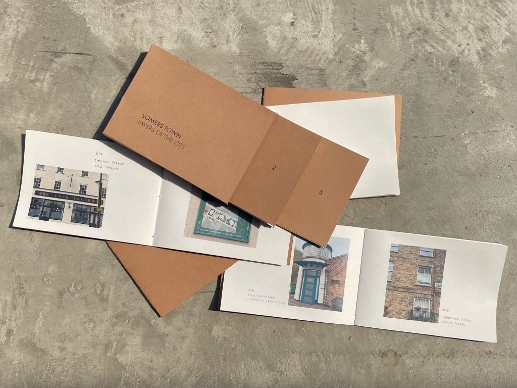
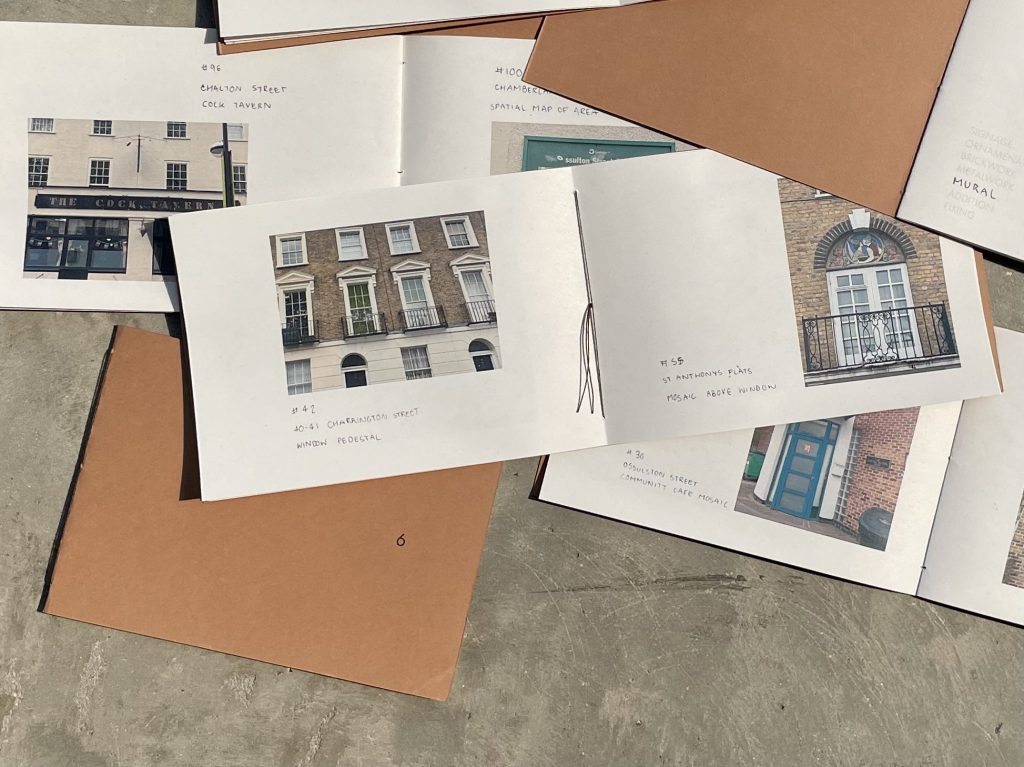
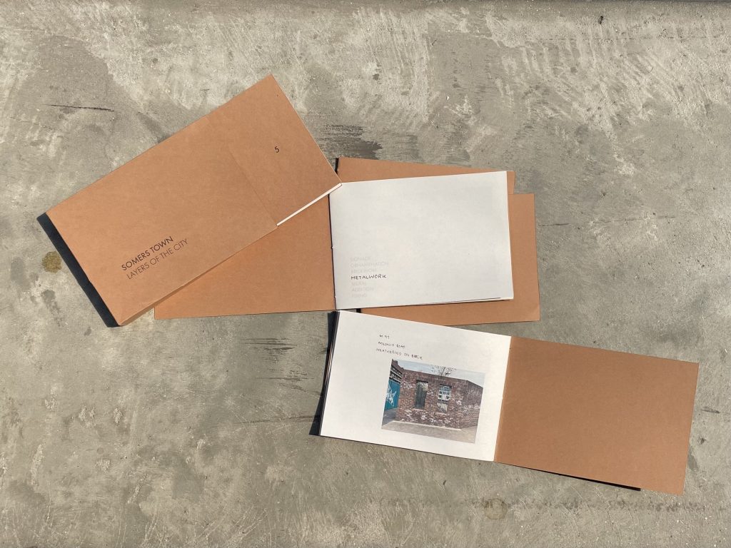
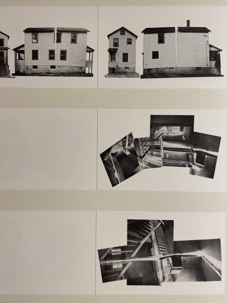
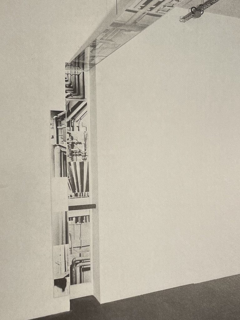
My positions through iterating studio work mirrors the themes and methods explored by Gordon Matta-Clark. Throughout Matta-Clark’s work there is an impetus to disentangle architecture as an icon; instead understanding space as a reflection of the people that have once existed within it (Crow, 2003). During the first week of investigation, I observed the buildings of Somers Town exclusively from the outside. Gordon Matta-Clark’s process guided me away from analysis of the building’s facade and deepened my enquiry to reveal the exposed fabric of the building from within the space. This shift from external to internal yielded more insight about the layers of history that are present within architecture, and repositioned my work with the context of the west coast of Ireland.
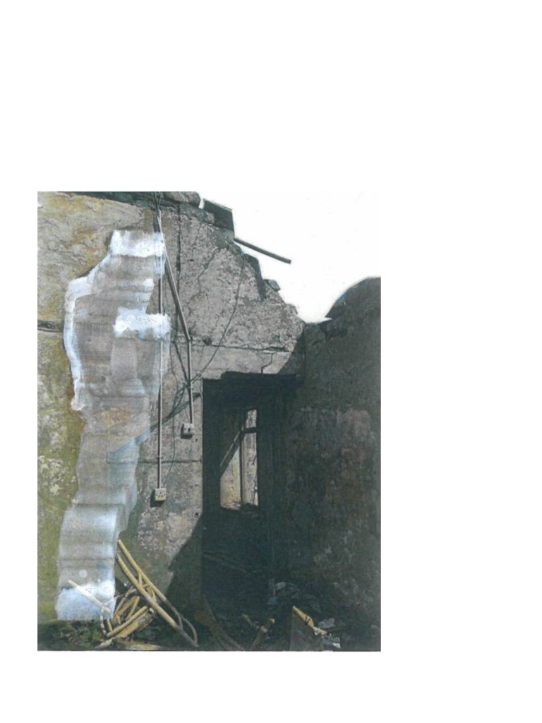
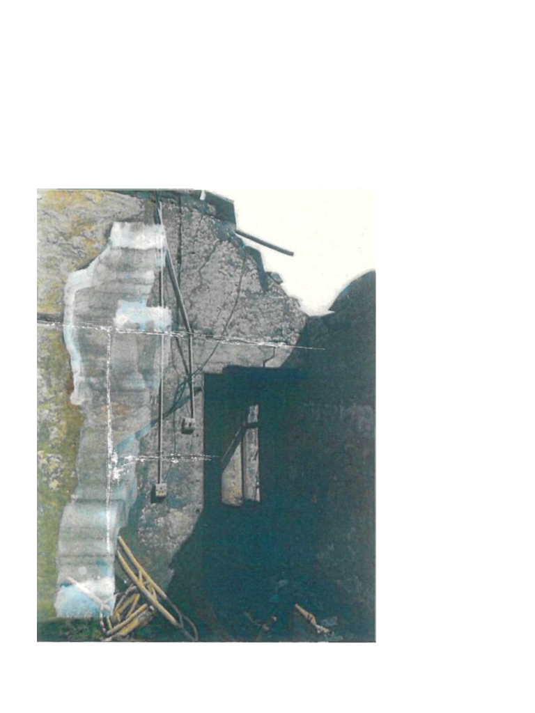
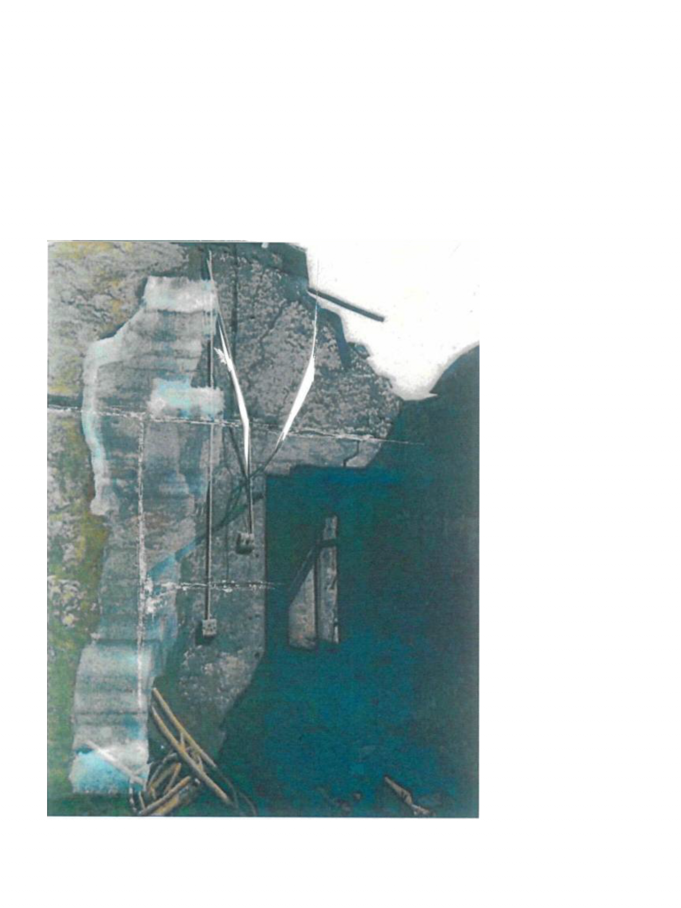
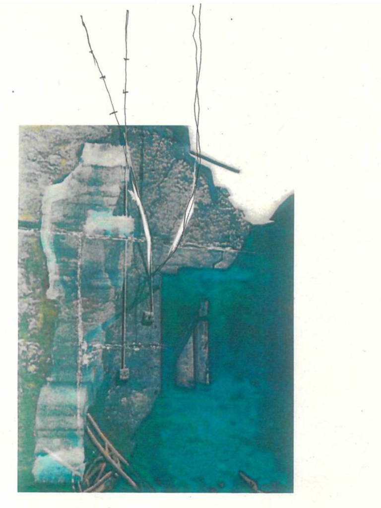
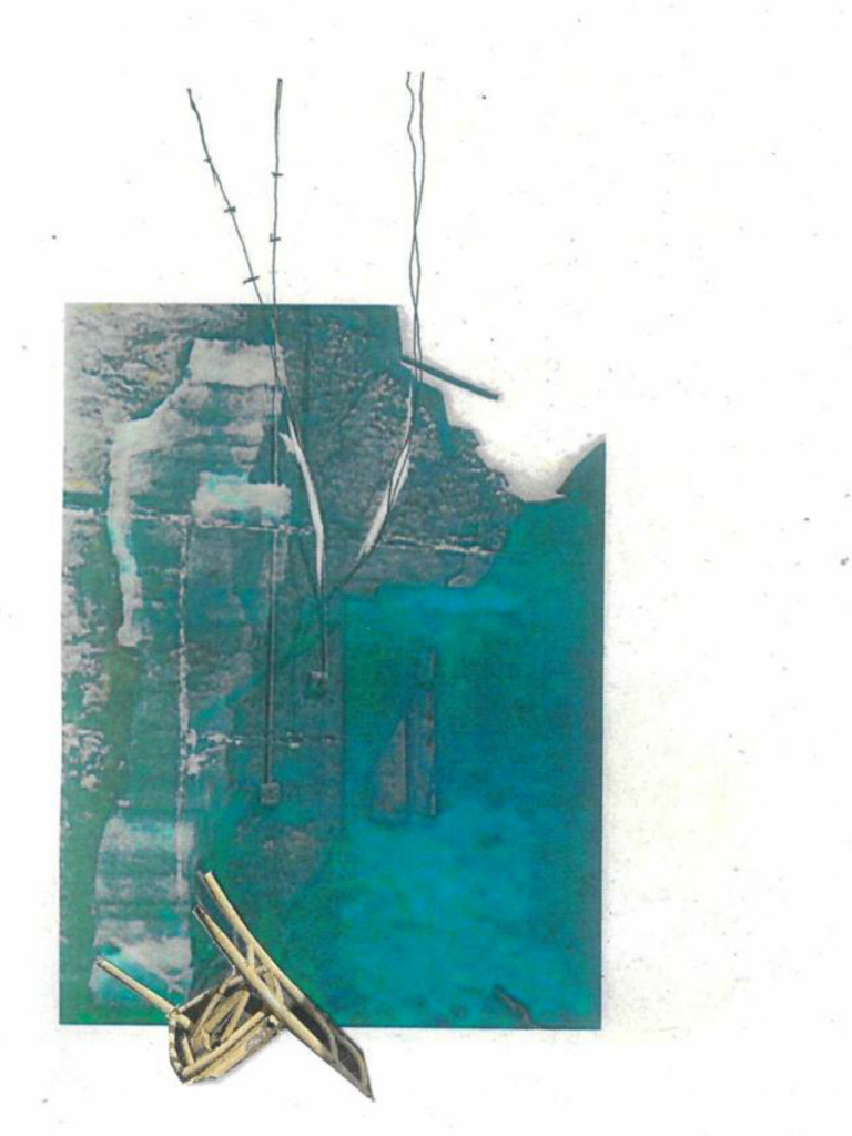
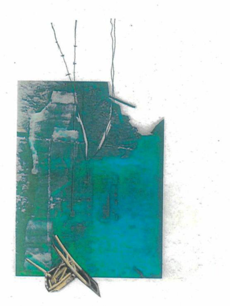
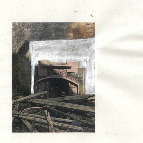
Gordon Matta-Clark employs collage as a key method to understand the workings of a building. The process of image manipulation and collage remained central within the second week of positions through iterating as I overlayed, distorted and degraded photographs of the stone cottage structure. This technique allowed me to speculatively imagine how the buildings could return to the landscape and what may become of them over time.
Perec, G. (1999) ‘Species of Spaces’, in Species of Spaces and Other Pieces. London: Penguin, pp. 46–56.
(references drawn from the course reading list that situate your project in a broader discourse or conceptual domain)
‘What I hope for from it, in effect, is nothing other than the record of a threefold experience of
ageing: of the places themselves, of my memories, and of my writing’ (Perec, 1999).
During the positions through iterating brief, I reflected on Georges Perec’s (1999) ‘Species of Spaces’. I was initially inspired by the notion of observing to decipher a small part of the city. This is apparent in my work during the first week, as I critically explored Somers Town and collected moments where layers of history are apparent within the urban environment.
Throughout the second week of the studio brief, my work expanded into a process of image-making as a form of research. This investigation used speculation as a critical tool to understand how the building may evolve over time. Perec (1999) denotes the relationship between place, memory and writing as effective record of the experience of ageing. These themes are inseparable as they all are dependent on one another. Through my initial work I have investigated the theme of place, with the intention of interrelating this to my own person memory of the west coast of Ireland through a writing practice. Introducing my own positionality and relationship with the location will further strengthen my line of enquiry and ground the project within contemporary discourse about the derelict homesteads in rural Ireland.
Suh, D. H. (2018) Robin Hood Gardens, Woolmore Street, London E14 0HG [Film]. V&A Storehouse, London.
(wild card reference (identify another type of relationship, or re-use any of the above prompts))
Do Ho Suh’s (2018) Robin Hood Gardens exposes the interior of the iconic building prior to it’s demolition. The film utilises 3D scanning and photogrammetry to piece together inhabited sections through the building (Suh, 2018). The artwork acts as an important thematic reference for my studio enquiry as it explores the life that sits exists the walls of the building (Suh, 2018). Suh (2018) highlights the individual personalisation of space, and investigates the relationship between the architecture and identity. The theme of identity is inherently apparent within my project thus far through my investigations into Somers Town in London and Easkey in the west coast of Ireland.
Till, J. (2009) ‘Contingency’, in Architecture Depends. Cambridge: MIT Press, pp. 45–61.
(references drawn from the course reading list that situate your project in a broader discourse or conceptual domain)
‘Architecture is dependent on others at every stage of its journey from initial sketch to inhabitation’ (Till, 2009).
Jeremy Till (2009) introduces the concept that architecture is not complete at the conclusion of construction, as it is exposed to contingency and will metamorphose during inhabitation. Architecture is merely a reflection of that moment in its life as people will continue to designate their own mark onto their urban environment. This reinforces the notion that architecture does not move in a linear fashion, but is cyclical or layered as it weaves together a tapestry of the threads of its history.
Throughout ‘Contingency’, Till (2009) does not acknowledge the life of a building after inhabitation. Arguably, this is where contingency is most apparent. During the studio brief, I explored the life of a building post-inhabitation, whilst also reflecting on the form of the structure whilst it was in use. Contingency is an implicit line of enquiry throughout my work as I play with the temporality of the building through speculation of it’s past and future form.
Whiteread, R. (1992) House Study (Grove Road) [Correction fluid, pencil, watercolour on colour photocopy].
(reference that is specifically related to your project in its medium or method)
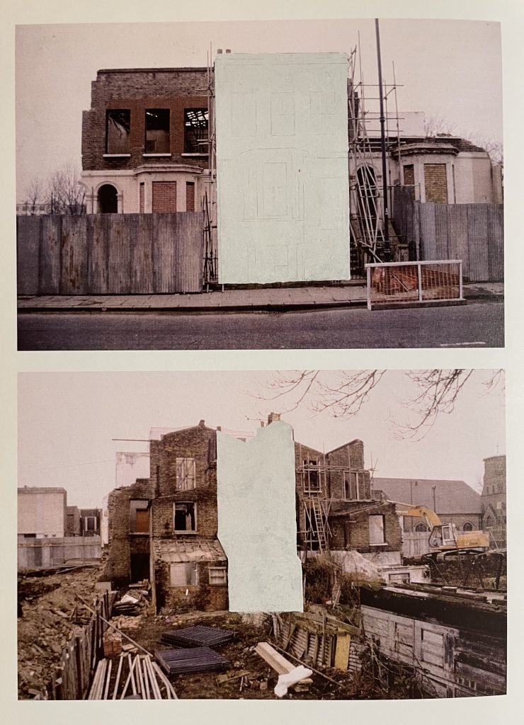
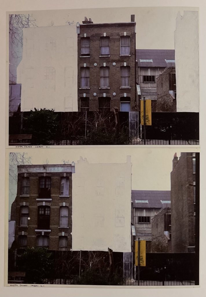
House Study (Grove Road) by Rachel Whiteread (1992) utilises analogue methods of image manipulation to conceal and reveal parts of a building mid-demolition. Whiteread’s (1992) studies further heighten the sense of palimpsest within the architecture, as the buildings due to be razed are portrayed as ghosts of the city.
Analogue image-making was my primary method of investigation as I iteratively altered, scanned, and printed photographs of the derelict stone cottage structure. This drew direct inspiration from Rachel Whiteread’s (1992) process, in particular the use of correction fluid to hide and expose elements of the photograph. The degradation of the images mirrored the degradation of the building, and the visual language began to reflect the landscape of Ireland in the final few iterations. The concept that the building returns to the land is a theme that I intend to explore further through the subsequent briefs.
Wyld, F. (2016) ‘The Moving City as Palimpsest’, Landscape Architecture Australia, (151), pp. 65–68.
(reference that demonstrates a critical position in context of your specific topic, medium, or method)
‘The city is a palimpsest; it moves within time as a collection of layers for those who read it as a textured landscape. I love this city, but it is not mine. I am living on stolen land’ (Wyld, 2016).
Frances Wyld (2016) astutely introduces the idea that ‘the city is a palimpsest’. In this context, palimpsest is used in reference to the evolution of the urban environment. The development of the city is not linear, but layered. Layers of history, architecture, people and stories are embedded within the urban fabric of the city. Palimpsest formed my initial line of enquiry as I documented how layers of history can be observed within London. Wyld (2016) writes of ‘the city as palimpsest’, which ignited my interest in considering how this may be translated into a rural setting, and whether a ‘textured landscape’ of layers can be observed here too.
Wyld (2016) adopts an ethnographic viewpoint of the city as she reflects on her own position within the history of Indigenous culture and urbanism within Australia. This sparked me to reflect on my own positionality within the context of the rural west coast of Ireland. Despite spending a large portion of my life there, I am still an outsider. Due to the clash in the culture between where I grew up in the south of England and the realities of life in agricultural Ireland, I will never be able to understand rural Ireland in its entirety. My acknowledgement of my ethnographic position is pertinent to fully contextualise my work and the critical narrative I am trying to convey.